
Some odds and end this time..

a few quick snaps of some random things that'll probably throw in some of the art books.

sometimes, it's more fun catching a glimpse of something rather than seeing the whole thing.

Seeing the whole picture is sometimes cool too,

so these books should have a little of both, don't you think? brief 'glimpses' and 'full money' shots.

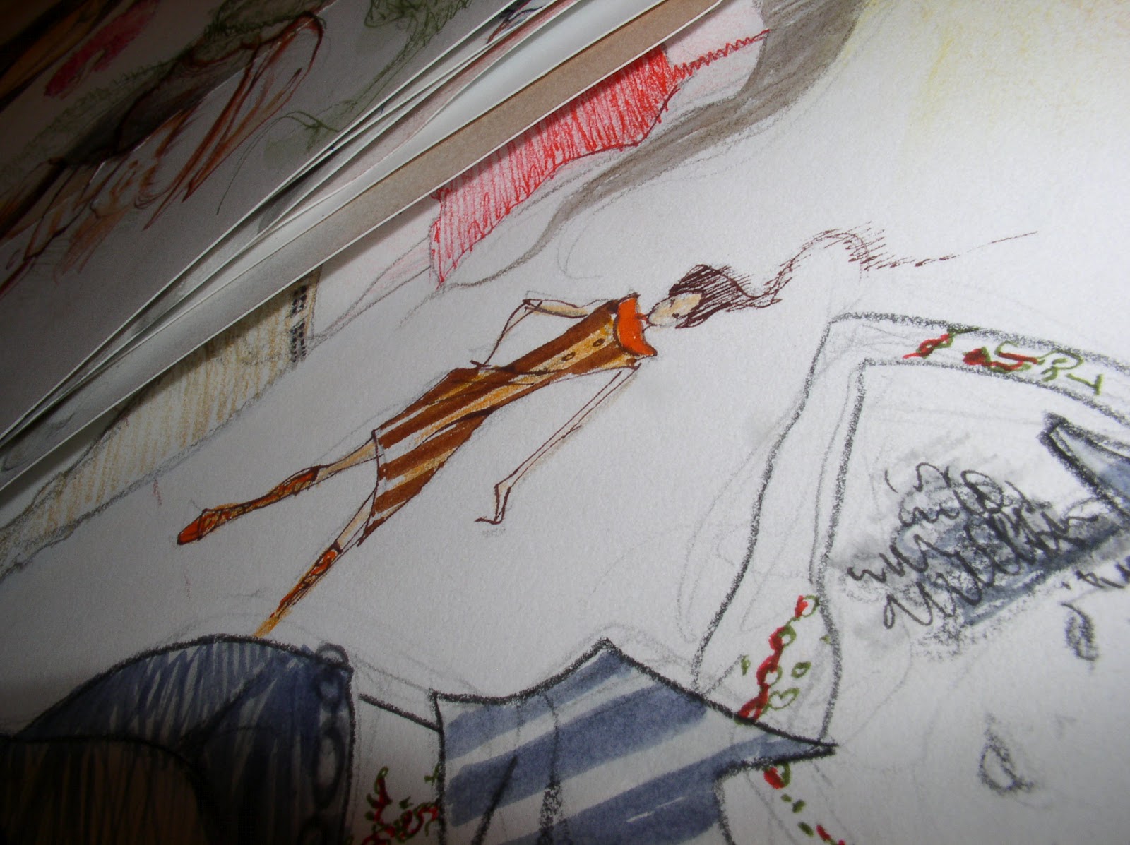
This girl with the rocks always looks like a moebius drawing to me.

Maybe because the rocks are floating? Dunno. Crude little scribbles mixed in with more detailed stuff. Trying to leave some unfinished stuff too.
My favorite art books are ones that show the flaws, mistakes and thought process, half finished pencils, random sketches..
Didn't get to it in the comments but i wanted to thank everyone for their sharing the cool wacky stuff they used in their art, esp. some wonderfully diverse stuff both Christina and Aaron and Cody mentioned.
Thanks to everyone else too. Good to know i'm not alone in this collecting 'weirdness'. : )

I am thinking instead of a volume 1-3, maybe each book should have a theme?
Book One: rust metal stuff (like the magic boxes), legs and other mechanical or weird creature sorta things...
Book Two: is mostly trees, moss, asian women, and has a subtle old world feel? Also the fashion stuff could go in here too.
Book Three could be Pink furry anima craft sorta girl crap, collages 60's retro stuff and
That one way to go, that way if your into a certain subject that book is one you could be sure and pick up.
Or maybe ANOTHER way is put a little of each in every book? More diverse that way, what do you all think? i can't decide myself. I just don't want people feeling obligated to by all three, but it might get boring if each book is ONLY a certain theme?
I dunno. There's still time to play with it. But the cool part of a blog is you guys ( i mean girls too when i say 'guys') can throw me some feedback, (like the preferring 'sooner-than-later' release date idea.

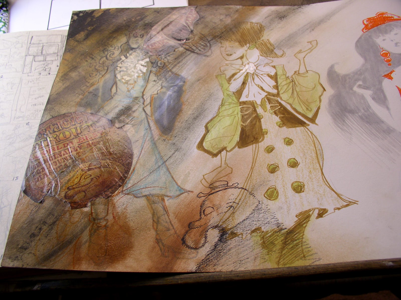
In a way i feel less like i am creating these trout ads and more like somebody who does restorations.

The quality of an old fashioned at is an art form itself, and my wonky versions will never be slick or professional, they're not supposed to be.

I like that hand made feeling Trout ads have... as opposed to the Chris Ware slicker approach. Nothing agist Chris, i LOVE his stuff. Just explaining why sometimes there's an amateurish hand-drawn feeling to them.
I pasted these down from some re-created adds i copied by hand. Then burnished them to the surface, that's why they've got that wrinkled texture to them.

It might not be visible if i didn't get in here with a tight photo of it..

Weird the kooky things i obsess over.
Textures.
Shapes.
Feels good i'm not alone in that.
