Thursday, October 11, 2012

...a couple more...


Just for fun..


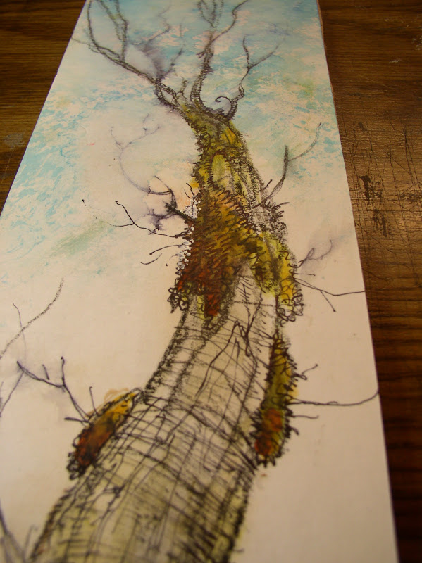
this green tree was done on the back of a comic book board with waxed surface.


almost threw it out... but seemed a waste.


i was able to scratch some leaves into the wax with an exacto knife.


also across the tree trunk too.


you can see i 'slimmed' the trunk down too..


decided not to hide the blend, since i wanted a soft edge to the trunk..


this one's a little different..


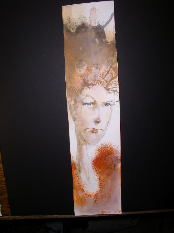
i cut out another tall skinny strip of bristol.. 


this pics a little burry, but i left it in because the focus is the center. I wanted to blur the branches so i used a pen with non-waterproof  ink... 


i think i got lost in some detail along the way though.  


I was trying to avoid too much rendering..  


but the temptation to blue the top and olivia the bottom was too great. 


as we all know, with watercolor, you just close take a breath, tilt paper, and see what happy ( or unhappy) accidents happen... 


anyone else notice how a different proportion causes you to think, and draw different specially? Not just drawing a vertical tree...


...  but being hemmed in with a certain proportion? 

almost like how a photographer crops and composes an image, isn't it? 

well at least this Tall Tree... feels slightly different than the Green Tree, (which is the usual cliche Tree usually fall into painting.)  This tree fells like a lush soggy Autumn to me, which i can feel and smell in the air right now. 

Plus if any of you got sick of looking a side-ways Judge Dredd, now at least...you have something *else* to stare at when you check this page, eh? 

: ) 

Until the next one... 


Tuesday, October 9, 2012

Last of the Four...


Okay, here we go..


Jumping from Dredd back to a few smaller watercolors...


this orange splotch... i've just decided...


will be a tree.


but i'll set aside the watercolor to dry... meanwhile start inking this Dredd commission. It actually went pretty slowly..


i had fun trying something i haven't drawn in ages though.


any guy with a big jaw seems up my alley.


Jumping to another watercolor, these are tiny ones, 3 by 4 paper.


this one came out so fast


i forgot to take photos the process..


back to a little more on the Judge again... I wanna stay loser on the lower body, but keep his head and shoulder and upper body in focus with some detail. 


is shoulder will look a tighter than this. 


by blur... i mean more like... abstract vertical lines. 


meanwhile here's how the tree turned out.. 


always one for something child-like 


or silly. 


perfect balance to those dark angst-ridden super heros, eh? 


here's a taller piece of bristol i did one of my 1900s gibson portraits on


just a breath of fresh air.. 


you know, i used to think i prefer paintings of pastoral subject matter to darker things, but that's not true. I seem to enjoy both sides.. 


so it's obvious i skipped lunch and succumbed to junk to finish Dredd. : ) 


here's another shot of it.. yellower lighting makes him look transparent. 


bigger still. 


And here's it is. Hopefully the guy who bought it won't feel cheated i got a little abstract on the feet. It actually took just as log to paint it this way rather than a fully realistic version. 

You never know how it will turn out when you sit down to paint something, do you? 


So there it is folks. Four in a row. 

Now this time i PROMISE i won't wait two weeks before another post.. 

- Sam 


Monday, October 8, 2012

Monday: THREE out of FOUR-DAILY posts.


Okay, other than this Death pic, to kick things off...


...here's a series of things..


..still being finished... not sure if i should keep this woman's stripped top just black and white, or color it in? what do you think?


The contrast of how the thick fabric folds hang.... might get lost if i color in black and white. I'm so proud of myself for leaving the bottom all raw looking.  Maybe we get enough color just rom what we see in her sleeves?


The point isn't how smoothly i blend the folds is it? I was going for a it's contrast between black and white stripes... and the shift from solid black... to grey at the bottom.

So the question here is... is it time to walk away from this drawing?  Leave enough alone?


This one's not especially impressive yet. Both the face itself is sorta bland so far.


The texture clothed around the edges I used to wipe down my brushes, so i worked it around the edges of this drawing..

here's some options i may try to jazz it up a little.


I put it against a dark matt board, or could even use a black hand painted canvas?

A second issue is wither to start rendering her face... or leave it just have drawn as it is... and maybe blend the cloth on the sides into the face? The idea i had was to soften the abrupt shift from brown face to ragged blotchy cloth?

A third option is to color the cloth itself a solid color, so as to downplay the distracting various colors around her face.

I know there's no right or wrong, just personal whim of us artists. But with each decision, unlike digital (not slamming digital, i use it too)... but WHEN hand painting... each door you open, may close another one behind you. Which is both a drag, but also crazy exciting. No safety nets if you screw up.


So, unsure on this one yet. Maybe it's more interesting *not* to blend the edges? Leave it raw and unblended?


Okay, that one's up in the air. Onto something else... In this one were back to the shiny wax coated poster paper that's on the back of those Maxx posters i have lying around.

I almost threw them out, but they have inspire some nice fashion marker quickies.


I tried to keep this woman's face stark and let her hair and robe grab our attention. I threw in some botched made up Kanji here at this end... and by the other side... i sorta descended to totally random shapes that sometimes suggest inuit Bill Reid inspired Raven carvings, which i am totally in awe off.


Hopefully not in a pretentious way, just for fun.


'Mixing up crap that usually doesn't go together' is sorta my thing. Hobby. Guilty pleasure.  This one was about motion ( her hair) ... and two different visual alphabets, from Kanji to Native American Inuit art.

All doodled on the back of a Maxx comic book poster, which is sorta a third language. Kinda goofy fun.


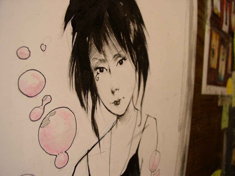
...which brings us back to this gothic lovely lady.


I never felt drew her as well as Dringberg or Chris Bechalo. She sort of came to life after i left the book.  For this commission i tried to keep it simple... the focus really is her face, hair and shirt.


The guy asked her to surrounded by bubbles so  had her blowing pink bubbles.


didn't have much chance for process pics on Death so i just grabbed a few shots before i mailed it off. Funny how simple these things begin isn't it? Any detail is like house paint and wallpaper,

but all our creations ....start with this humble little drawings on our sketchbooks.