Monday, October 8, 2012

Monday: THREE out of FOUR-DAILY posts.


Okay, other than this Death pic, to kick things off...


...here's a series of things..


..still being finished... not sure if i should keep this woman's stripped top just black and white, or color it in? what do you think?


The contrast of how the thick fabric folds hang.... might get lost if i color in black and white. I'm so proud of myself for leaving the bottom all raw looking.  Maybe we get enough color just rom what we see in her sleeves?


The point isn't how smoothly i blend the folds is it? I was going for a it's contrast between black and white stripes... and the shift from solid black... to grey at the bottom.

So the question here is... is it time to walk away from this drawing?  Leave enough alone?


This one's not especially impressive yet. Both the face itself is sorta bland so far.


The texture clothed around the edges I used to wipe down my brushes, so i worked it around the edges of this drawing..

here's some options i may try to jazz it up a little.


I put it against a dark matt board, or could even use a black hand painted canvas?

A second issue is wither to start rendering her face... or leave it just have drawn as it is... and maybe blend the cloth on the sides into the face? The idea i had was to soften the abrupt shift from brown face to ragged blotchy cloth?

A third option is to color the cloth itself a solid color, so as to downplay the distracting various colors around her face.

I know there's no right or wrong, just personal whim of us artists. But with each decision, unlike digital (not slamming digital, i use it too)... but WHEN hand painting... each door you open, may close another one behind you. Which is both a drag, but also crazy exciting. No safety nets if you screw up.


So, unsure on this one yet. Maybe it's more interesting *not* to blend the edges? Leave it raw and unblended?


Okay, that one's up in the air. Onto something else... In this one were back to the shiny wax coated poster paper that's on the back of those Maxx posters i have lying around.

I almost threw them out, but they have inspire some nice fashion marker quickies.


I tried to keep this woman's face stark and let her hair and robe grab our attention. I threw in some botched made up Kanji here at this end... and by the other side... i sorta descended to totally random shapes that sometimes suggest inuit Bill Reid inspired Raven carvings, which i am totally in awe off.


Hopefully not in a pretentious way, just for fun.


'Mixing up crap that usually doesn't go together' is sorta my thing. Hobby. Guilty pleasure.  This one was about motion ( her hair) ... and two different visual alphabets, from Kanji to Native American Inuit art.

All doodled on the back of a Maxx comic book poster, which is sorta a third language. Kinda goofy fun.


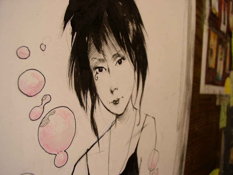
...which brings us back to this gothic lovely lady.


I never felt drew her as well as Dringberg or Chris Bechalo. She sort of came to life after i left the book.  For this commission i tried to keep it simple... the focus really is her face, hair and shirt.


The guy asked her to surrounded by bubbles so  had her blowing pink bubbles.


didn't have much chance for process pics on Death so i just grabbed a few shots before i mailed it off. Funny how simple these things begin isn't it? Any detail is like house paint and wallpaper,

but all our creations ....start with this humble little drawings on our sketchbooks.


Sunday, October 7, 2012

Two Kids on a Tree Stump.


What's all this about?


Just another commission that needed finishing up. 


as if you probably already noticed, this is a tree stump.   my usual style of a slightly olive green and brown tree... with orange-ish spotted 'shrooms hugging the edges... 

...this was done for a nice guy who asked me to draw his kids into a similar picture to the one i did below. 


Remember this one? 'Dana and popette', ( which by the way Alex Pardee will be making into a print.. thanks dude! ) 


Back to the new painting: This kids I tend to draw sorta have that Calvin and Hobs feel, ( with those 'little orphan annie' eyes  and use lush brusk strokes ). 


But there's a little of me in here too. Hopefully. As you can see i'm lavishing way to much detail on this stupid tree stump.. enough already - time to move on. 


I'm neglecting the rest of the tree... let alone the kids on top of it! 


This little boy is supposed to be holding a stuffed mouse. 


The little girl will need dark curly hair.  If i wasn't drawing super heros, or weird scribbles in my sketchbooks, i'd probably revert to drawing this kinda stuff. Way$sack was telling me he feels like my stuff has less Testosterone in it than in the old Maxx or Wolvie days. It's probably true. 

Maybe i just made peace with my femme-girly-soft-pink-plush-toy side? 


Whatever it is... I suspect whatever harsh edge of i have left inside me... come out in a different form now... less macheesemo and big guys beating each other up, and more emotional conflicts. 


Okay - one kid down... one to go...  weird seeing an uncolored figure.. sorta like all the life is sapped out of it. 


Funny how color really pumps life into everything, doesn't it?

okay, upside down... so I don't drag my palm across the page and smear it.

Now let's add some trees up top. 


Wet in wet... not too detailed because the focus is the kids and tree stump, *not* the trees. 

Hmm... that mouse he's holding is pretty big...  yikes, hope the mouse doesn't look too much like a rat. 


Oh well. Too late to sweat it now... just need to let the trees dry before shipping it out. 


Also, if your at New York Comic con... my old buds Way$ack, Alex Pardee and Skinner will be there.  Drop by and say "hey" for me, if you happened to run into them. 


Okay, onto Tomorrow's posts now.. 


Saturday, October 6, 2012

FOUR DAYS of Bonus-Posts!!


Yaaay!!!! - Four days of NEW posts- Sat. Sun. Mon. Tues. - every morning a new batch... it's my humble THANKS for everyone sticking around the last few week!


Plus kinda cool watching the followers inching up to past 600, (darn it i missed *seeing* it go from 599 to 600 - maybe i should ask someone to quit?  ~ kidding!)  -


but seriously, i don't care of there are 6, 60 or 600 folks digging this stuff, it's just the US, connecting. artists and non-artists checking out each other's stuff. I check out lots of your stuff too.


In the old days fan letter in the back of comics were all we had, and later, comic cons. It's so... communal now online. Okay, enough feel good crap.


Here's some new stuff.. mixed bag of sketchbook doodles, speed paintings ( giving myself three minutes or less)... and a few commissions too. Not all commissions have process pics, when i was in the zone, i sometimes stupidly forgot to even grab the camera.


I didn't set out for this guy to look line an indian... just what came out of the brush... outback Maxx's head dress was inspired by Native American head dresses..


This pony tailed bikini girl was my take on Julie... i did it with brown ink rather than black, tried to keep it airy and light.

It didn't make the cut as a commission so i told albert to throw it up on the site if anyone's interested.


Most of these are just trying to wake myself up, breaking out of the brown sketchbook routine.

This angle makes this poor lady's behind look rather large doesn't it? That's okay. I've a fondness for larger figures, obviously. But ll kinds of bodies.


There's so much variety when you look at *real* people instead of magazines and television. We all look... normal in real life.


Even if were often all often emotionally screwed up inside, which i like too in a depraved sorta way. 


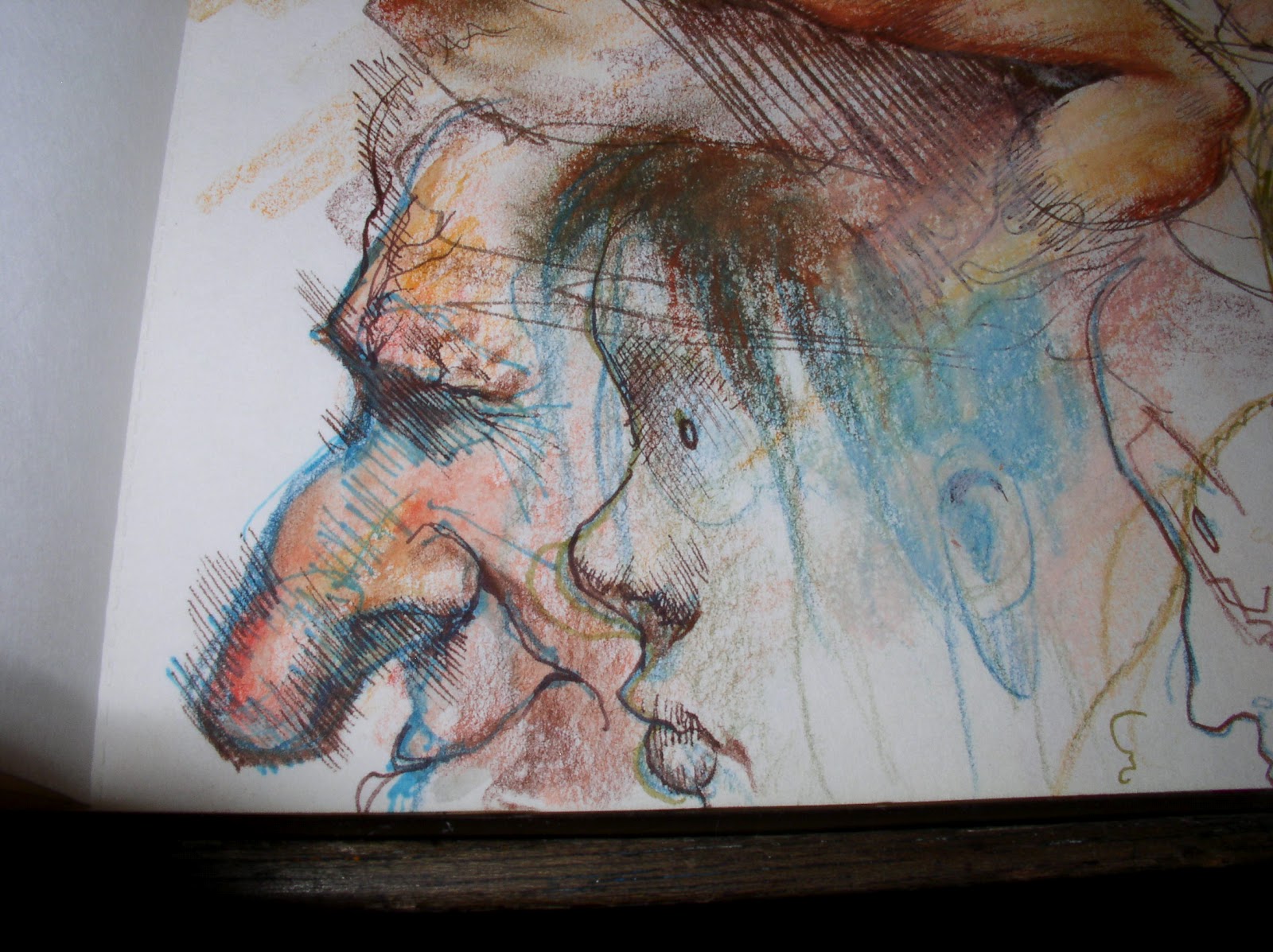
Here's a few figure studies too... something always gets lost when your not using your whole arm to draw on a larger sketchpad... maybe it's just me.. i dunno...


I keep looking for something in more scribbly looser sketches... like those doodles Roy Krenkel, Mike Kaluta would do.


Yeah, I lack the skill these and others have at figure drawing, but it never hurts to keep trying, reach past what i usually do.


Or what just comes easiest to me. Which is more the more of a cartoonish style.


It has taken me years to learn ... cartoony... nothing to be ashamed of.


...more self-manufatured B.S. shame.


more stuff to cut myself free of.


Funny how we're often the architect our all our own troubles huh?  ( Or i am anyhoo... )


Btw, here's a cool ILLUSTRATOR LINK to a nice site that has a brief overview of lots of illustrators.. not a complete list, but a nice sampling. I try to look up someone new name every day.