I hear from friends the first couple issues of Batman Confidential are out. I know myself too well to get suckered into looking at the printed comic. I always freak out. The look of printed comics is always a disappointment. Maybe it's the 'light through monitor' stuff, spoils me? I do like printed stuff in general, art books, i can appreciate how the eyes rest on printed art, but when i see my own stuff in print ... i dunno...
...ALWAYS looks worse printed... i always feel like somebody else drew it. It's too late by then, can't fix it. Have to move on - which is great because my opinion doesn't matter.
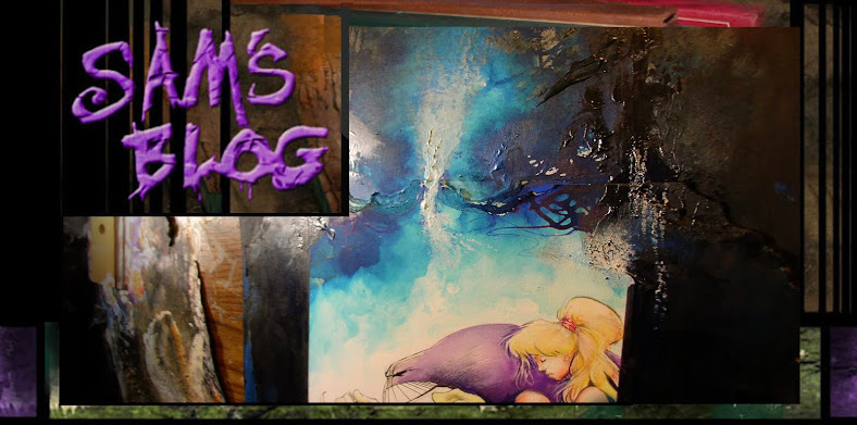
Here's some bat pages i drew in 'raw' form (above, before photoshop tweaks) and will throw 'em up so you can compare.


Hit and miss; sometimes digital is our warm fuzzy friend, sometimes the original hand-drawn stuff gets lost or watered down with Mr. Evil Computer. 'Overworked' art that loses the life in the inks/colors is a specialty of mine.
I think this is why i'm becoming increasingly interested in Japanese & Chinese brush paintings. Kinda like hand painting as opposed to 'for reproduction'—working on paper/canvas where you don't have a technical net to save your ass, just flung into the moment, fast and furious.

Like doing sketches in front of other people. I'd rather see a bold, unapologeticly screwed-up drawing than a timid, overworked anal one.
Just sent out some color notes for Jose Villarrubia, an amazing artist who's coloring Batman Confidential 40. Because i paint some panels/pages, it's sometimes unclear what's 'done' and what needs coloring. I have a feeling Jose is slumming a little here, because he's an amazing artist in his own right.

Thought it might be cool to check out my 'color notes' to him for the first issue. I'm sure everybody does this differently: corrections over the phone, written in e-mails; i did it this way with Jose because he liked it like this. Dave Stewart's coloring an Arkham hardcover—it's a whopping 96 pages... (finishing on the last few right now), so i was lazy and just wrote up color notes in an e-mail form to Dave. He seemed cool with that.

Funny the goofy stuff you say in notes when you're talking to another artist/colorist.
I still feel cheezy when i use a lens flair, or most digital trickery. Ever notice how most photoshop effects are looked at with suspicion among other artists? There's a trace of disappointment when they talk about it... they sorta always sigh, "...hell, i can do THAT... show me something i can't do with a filter or plug-in." Attitude. I feel it too.
Sorry i missed last week. Busting my ass to finish Arkham up this week!


