Showing posts with label Hollows. Show all posts

Monday, July 16, 2012

Hollows Cover 1


...I guess Chris Ryall showed off the Hollows cover at San Diego comic con this friday, so i thought I'd throw up a couple of versions of it here on the blog too. I was torn about what do draw on this cover, because i wanted it to look more organic like the book does.


(Btw: Here's a version of the same cover with a subtler background texture i added in photoshop.  the cover on the left is a more hand done, and little washed out because of the camera flash)


By 'organic' i mean not slick and perfectly polished... more rough and less technically showing off. I' think i've done enough of that crap in my career, eh? But at the same time, it IS a cover, so it needs to have a little bit of a 'wow' factor, right?

Both covers are hand done... the big difference is the back-ground color.  It's really just personal preference on whatever background one likes. Digital gets a bad wrap, but i do like the choice it provides mostly background options.


But composition wise, my main focus ignore melodrama and o do just a simple Three Figure Cover, with...


1  dude with wings
2  little girl
3 'burp': ( the pink chibi-esk critter )

..all just standing there.  Shows some scape of the wings, and that the storys about more than just big-ass Giant Tress with Cities in them.


Sometimes simpler is better. Hopefully.


Here's where i didn't do it in a big enough sheet is bristol, but i's already painted it so i had to glue in another sheet of bristol to make the top bigger. i wonder if it will show up in the printed comic? Probably.


The gears inside the wings were an interesting challenge, i didn't want to just ink them and hand color them, (which is the way i did in  most of the book.) i wanted to 'suggest' them in a rough painted style.

So i tried to do the 'under shadows' of the gears which are somewhat visible, then add some gear high lights which in white ink, so they'll bring out some shape of gears..


Once i added water, 80 perfect of all the gear detail just TOTALLY evaporated..  and most of the detail will get lost when i added the wash over the gears. but i tried to working back in and bring out some shadows and highlights...


..or that was the idea. Might not have totally pulled it off. Either way, but was cool trying to try something NEW anyways.

Here's those two version of the cover again, but i added a third 'scanned'  version (so you could see it without the camera flash)..


So the only question is, not which is most dramatic, but which works better for this relatively quiet three shot of them?

---------


Now, just for fun...


 here's a few quick pics of a curiously manic looking distorted fellow who i did in ink and pastels..


not trying to pretty or detailed here, just wanted to capture some motion and gesture.


okay,  can't end this post with such a unsettling image...


how about a nice big haired asian lady instead? Better?


Oh hell, let's just stick with the cover then as a 'end' image.

- sam


Wednesday, July 4, 2012

Birds, Chickens, Foxes, and a weird little pink creature


Just a few odds and ends today... not taking today off, just enjoying the quiet as others do their fourth thing-ys.

The drawing (above) is a Junko... least i think it's a junko. Some sorta puffed-up kinda bird.  There's probably about sixty or so little animal illustrations i've done for my wife over the years... most  fans haven't seen 'em yet. Figure they can be spread through-out the three 'Worlds of Sam Kieth' art books, just to add some variety.


This one isn't me, i wish it was. Jon's in fire lately and kicking my ass, in a good way.
Dunno if any of you have been keeping up with the last 5 or 6 pages he's done on Chickens ... but he's pumped NEW LIFE back into it,


Above a sliver of a panel from my batch of my chicken contributions.

Jon's latest has re-inspired me to do another batch of nine pages in a row, following his Worth checking out if your into his/and/my stuff.  They way i plan to deal with Jon's fantastic hot streak is to pull against it. Where do worse art... but ... when his gets furious and detailed, i'll tried to go soft and muted. Course we're BOTH so all over the map by now and changing styles in nearly every  page, that any modulating to each other... is out the window.

But that's a good thing actually. It seems to have a momentum all it's own now, after the 6 month of flaking (mostly my fault).


Meanwhile, this little guy is something i threw into the hollows book. Chris Ryall asked to add a 'sam creature' into the story, so this is what came up with. It's a low rez scan, but i kinda like how hand drawn and soft leaded it looks..

While this book had some digital stuff, (mostly blackened panel borders... a few hand done washes i drop into backgrounds), but MOST of it is possibly the most 'organic' looking book I've done at IDW so far.


Here's a couple panels i'm finishing today, it's got this quirky scientist dude (who flies around with weird mechanical wings, (he's body's not finished yet, obviously)..  and another city tree above too. The whole thing just sorta grew naturally from things i liked to draw, even though it's Chris plot.

I need to get a cover for the first issue done this week.


This Fox above is also drawing done for my wife. I did it on recycled paper ages ago.. butI decided to to lose the brown texture in photoshop, but the white version has lost much of the subtly.

Can't decide which one should go in the art book though, any preferences?


Dana & Nola Update: YAY - I've also found a way to pump up the PRESSURE on myself to finish Nola: each week i'll do one page strip of it. They're deliberately drawn 'simple' for the most part ( panel on the left) .. but sometimes i'll go a little more detailed on some faces ( right panel)... it just depends. Nola is comedic telling Dana off she she's cartoony there, and Dana sighs in a more quasi-realistic panel. ( as realistic as i get)

Part of the hold up on finish this book was, some pages are wild off the wall painted and stylized, and others more nine grid less flashy 'story focused' pages. I couldn't decide which goes where, graphic as over 150 painted, stray-toaster style painted ones are DONE. Those were easiest to do. All i need to do left is the sedate traditional strip type pages, but i couldn't seem to finish any.


I realized a page each week, MOTIVATES me to pile up pages. It helps them come alive for me as characters too. I don't want you to have to wait a year to see who they are. Also it gets them lettered by Oni, so you can get to READ these two sisters story. And i'll throw the finished page up either on this blog, or a new one.

So it's on a (more or less) REGULAR schedule now.  Better than nothing huh? Give me a couple of weeks after San Diego to get them lettered and THEN thrown up to read,  okay?

What else? Chickens, up again. Dana-Nola? Back on track. Hollows, first issue is 98% done. Just fill in a few empty panels. Also, wrapping the last chapter of aliens this week too, so THAT will be done too.


This is off topic... but does  anybody else really into Junko Mizuno's Chibi drawings? I know she's been around a while, (i saw one of her books ages ago).. but i've rediscovered her lately.  Just love her stuff.

Go watch things 'Explode in the Sky' for me, because I'll be fast asleep by then.


Sunday, June 24, 2012

NEW CRAP to look at, ....and lots OF it!!!


Thanks for everyone's comments! Remember when you don't get any new post from me, it's good news: Means i'm working my tail off playing catch up on a buncha NEW crap.

( remember i use 'crap' with affection) ........ so speaking of crap..


.. i'm finishing the first issue of Hollows for IDW, (above) - which i'm pleased is sort of a cross between a hand colored book and a black and white one... so expect something a little different on this sucker..


And the OTHER job i'm busy with? ( see above) Knee-deep in the last eight page installment of Aliens for Dark Horse Presents.  - Yikes - Both Hollows and Aliens are ... due..  (of course) ..at the same time.

Again I am obviously more taken with drawing 'quasi-gibson-girl-hair-styled ladies and teddy bears rather than the Aliens, ( though i did enjoy painting this swell little Giger-esk cave) and it shows.


There's also lush drawings of women showing up in the Hollows panels above too.  But Hollows has much more big-assed-oversized-bonsai-Trees... rather than Teddy bears. Aliens: Teddy Bears. Hollows. Bonsai Trees.


I still can't *believe* got away with 20 Century Fox and Dark Horse approving an Aliens story with a friggin' Teddy bear, how messed up is that?  Pretty cool. And thanks to John Layman script, it actually makes *sense* there's a teddy bear in there now too... rather than just randomly thrown in like it would of be i had written it.


Plus I totally forgot I'd promised the HEROS charity folks to do a Fantastic Four cover...


And, well by a mistake, i accidentally discovered two extra FF covers lying around in packages i lost track of... (crap) ....


...so now, (because of my own stupidity in losing track)... have THREE  blank FF covers due today.


..hope they Heros folks aren't pissed i'm hogging three covers.  Promise i'll sit out any future FF cover gigs to make up for it.

Okay, i'm calling this FF cover (above) finished! pronouncing it D.O.A. -

i may get back to coloring it, or maybe it's cooler to just heave it in blue-ish half tone?


Now, onto the next FF cover..


Good news is these three covers don't ALL have to be in color.. so far... this one looks terrible. I may have to color just to save it from it's current horrible state..


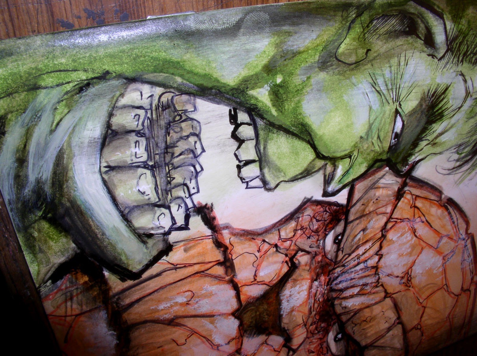
Better.  But better work on the hulk some more...


hopefully i can pump a little life into them in the next  hour...


....on this crazy busy sunday afternoon.

Okay, a little goofy looking, buy at least there's some life in it now. the Hulks teeth look like a circle or shot glasses on a round tray, don't they? Whatever.


Then the Heros guys also passed along me a couple sandman trade to add a quickie doodle in. I usually don't sign comics unless i'm a a con, but these are so late may as well throw them in with the FF covers package too, eh? Best i can do in one minute.

It's not a race, but i think any more i add may make this sandman look WORSE.. .so better quit while were ahead.


Now let's dive into the third and *last* FF Cover... this one is way goofy, just look at the things lower lip.


I'm pleasing myself here, no one else.


...and hopefully pleasing who-ever who buys it, because they'll have to be as screwed up in their taste as i am to appreciate it, right?


Sorry, this one came out too fast for me to get in any process pics, just zoned out while drawing it..


What else? Oh yeah, those the commissions, haven't forgotten about those too.


And Kim and I have promised each other to have the Potbelly toy FINISHED by next years San Diego comic con( actually it's me who fell behind getting him sketches, but he's re-inspired me to get back on top of that too. - thanks buddy!)

Let alone chickens. Here's proof i'm Jon and I are back on top of that too.


Hopefully this will make up for the lull of posts last week.

Bet you got sick of looking at that woman's face at the top the last post, eh? Me too.

Not that it's a bad face, just time for something NEW again..


- Sam