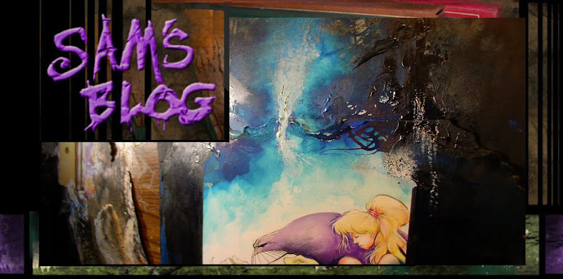

...I guess Chris Ryall showed off the Hollows cover at San Diego comic con this friday, so i thought I'd throw up a couple of versions of it here on the blog too. I was torn about what do draw on this cover, because i wanted it to look more organic like the book does.

(Btw: Here's a version of the same cover with a subtler background texture i added in photoshop. the cover on the left is a more hand done, and little washed out because of the camera flash)

By 'organic' i mean not slick and perfectly polished... more rough and less technically showing off. I' think i've done enough of that crap in my career, eh? But at the same time, it IS a cover, so it needs to have a little bit of a 'wow' factor, right?
Both covers are hand done... the big difference is the back-ground color. It's really just personal preference on whatever background one likes. Digital gets a bad wrap, but i do like the choice it provides mostly background options.

But composition wise, my main focus ignore melodrama and o do just a simple Three Figure Cover, with...
1 dude with wings
2 little girl
3 'burp': ( the pink chibi-esk critter )
..all just standing there. Shows some scape of the wings, and that the storys about more than just big-ass Giant Tress with Cities in them.

Sometimes simpler is better. Hopefully.

Here's where i didn't do it in a big enough sheet is bristol, but i's already painted it so i had to glue in another sheet of bristol to make the top bigger. i wonder if it will show up in the printed comic? Probably.
The gears inside the wings were an interesting challenge, i didn't want to just ink them and hand color them, (which is the way i did in most of the book.) i wanted to 'suggest' them in a rough painted style.
So i tried to do the 'under shadows' of the gears which are somewhat visible, then add some gear high lights which in white ink, so they'll bring out some shape of gears..

Once i added water, 80 perfect of all the gear detail just TOTALLY evaporated.. and most of the detail will get lost when i added the wash over the gears. but i tried to working back in and bring out some shadows and highlights...
..or that was the idea. Might not have totally pulled it off. Either way, but was cool trying to try something NEW anyways.
Here's those two version of the cover again, but i added a third 'scanned' version (so you could see it without the camera flash)..

So the only question is, not which is most dramatic, but which works better for this relatively quiet three shot of them?
---------

Now, just for fun...

here's a few quick pics of a curiously manic looking distorted fellow who i did in ink and pastels..

not trying to pretty or detailed here, just wanted to capture some motion and gesture.
okay, can't end this post with such a unsettling image...

how about a nice big haired asian lady instead? Better?

Oh hell, let's just stick with the cover then as a 'end' image.
- sam