Showing posts with label Moebius. Show all posts

Sunday, July 22, 2012

Three Faces of Catherine


Here's something i just sorta pulled out of my ass ( ...so to speak.)


Since Moebius was on my mind lately.... I drifted back to doing a face in an 'Idyl' Style, which were these beautiful a one page strips Jeffrey Catherine Jones did for National Lampoon in the 70s.  Obviously nobody draws women like Jones...


but, as a tribute, i thought i'd try inking three women's faces in three different styles.


Also, the title also being a pun on 'The Three Faces of Eve' movie, (as my ALL my art seems to suffer from 'multiple personality disorder', style wise..)


okay, sorta boring right now. also hard to see in light pencil, but you get the idea.  i'm not worried yet about the faces all looking exactly the same, a few eyes on some faces are little too hight, so will try to correct in the inks. But the point isn't them looking exactly the same, is it?


it's more an inking exorcize.  I'm trying to use a dry brush here.. that's why i've let it try enough to make 'tire tracks' on this piece of cloth..


bu first a little brush for those eyelashes.. the dry brush is mostly for *very light* ... almost feathery shadows right now.


in fact let's not even use a brush n her hair.. it's going to be the lightest of the three, so why not black colored pencil on the hair.


THERE - at least i'll have the self restraint NOT to add a wash for a change, which should keep it nice and airy. Sorta dark on left side, lighter on the other.


So next i'll use a thicker dry brush like Jones used in his Idyl one pagers. These are harsher direct lighting. This style is always trickier because any pencil flaws stick right out.


We have no soft face rendering to hide the flaws in do we, with classic black and white it's all 'out there' like a sore thumb isn't it?


I can already see her left eye is too high, so i didn't correct enough. oh well. This one came out much faster, and i tried to keep it rough and high contrast mostly...

...but i cheated a little.....add some thinker rendering brush lines in a few spots ..


Onto number three... for this let's do it in a nice blue grey with one of those asian pen brushes.. theres that lens shadow on the paper from my flash... sorry about that.  I need to pop for a new camera don't i?


 This face also went pretty fast..


you can see the ugly brush lines in he hair though. this time let's use a way to soften those, eh?


okay, that's a little softer.


i won't start in asking which everyone likes better, though i am curious.

Maybe a better question that which one we 'like best', is just... understanding what each one has to offer. Why choose one of these styles in a drawing or story? ( or a hundred others styles i'll never master)


Each style creates a different mood, even aside from the technical drawing skills in the faces themselves, ( or lack there of).


So which one i use might depend on the mood of the story, or even just mood i'm in when i'm drawing it. Duh. Belaboring the obvious here.  Guessing i'm working it out in my own mind though, because i so rarely articulate this crap, it usually happens automatically. Intuitively.


Funny, ... i was telling Jon Way$hak how, in my mind.. that when i'm penciling the Hollows panel i  pretending I'm doing my own version of Moebius drawing.  But when i ink a Hollows panel, i find myself imagining i'm Jeffrey Catherine Jones.

Course by the time i finish with whatever washes, colors or additional inks, it looks nothing like EITHER of them.. not that i could look like either of them in the first place.

So in an odd sorts of way, trying to draw past i usually look like, usually results in a more interesting 'sam drawing'.  Not always.  But, sometimes.


Even if what was originally in my imagination....

....never comes out of my pencil (or brush) as i intended.


Friday, March 16, 2012

Two Blobs, and Jeffrey Catherine Jones


I saw a terrific post of Jeffrey Catherine Jones illustrations (That's hers above) over at Golden Age Comic Stories blog.  Tons of black and white panels i'd not seen before. Totally worth checking out.

I keep coming back to Jones's work. It dovetails so many things I've been searching for on my own stuff for some reason. Minimal line work, yet painterly in that N.C. Wyth, Harvey Dunn, Frank Schoonover, way.  Yet, i always felt Jones' work had an intimate voice all her own.  Like Moebius... (though in a totally different way), her pen/brush strokes... suggested so much volume and form, yet always did so with such economy and brevity.

Meanwhile, back here on earth, the rest of us struggle on.


Here's a curious one: I took an old abstract painting on rough press watercolor paper and turned it over to the back, guess what i found?


A bleed through of the color from the front. But only in these two spots.


It got inspired (by a totally stupid waste of time). Why not try to make these two shapes into something else? So let's see... what could connect these two blobs?


How about a surreal branch of some plant? i know, an orange branch? I'll see where it goes though.. at a pot at the bottom.


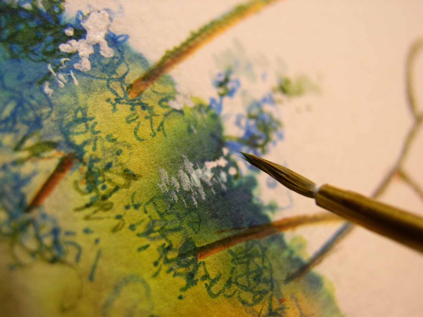
Adding some pen likes, which i'll soften and blend with water in a sec.  Just following along blindly here. But there's little at stake, so i can always bail if it goes south on me.


Still a litte too timid. What i'm worried about is adding so much pen lines to these blobs, they'll lose whatever abstract charm that had to begin with.


Throw in some white highlights,


Again, looks horrible this close, doesn't it? Might look equally distressing when were finished too, that's always the risk.


I still think i should blend these pen lines a little more... but i'm afraid of losing the original blob color altogether.  Okay, time to abandon ship for now, leave well enough alone.

Sort of a mixed bag this time. But the point of this blog, like the art books, is no secrets. Sometimes i'll lead us down a blind alley, sometimes we get a surprise. Having the guts to try, and often fail, is the thing binds us all together.


I was amazed when Moebus once wrote how much he struggled inking blonde hair.  It wasn't that he had trouble with it,  many artists do... it was the fact someone of his stature, admitted to it. It blew my mind he's be so open, so honest about struggling with anything at his level. Where as, to me, he was, (and is), an artistic Genius irregardless.  From what i've read, Jeff Catherine Jones too was savagely honest her work, openly admitting the 'disasters' along with her successes. It only makes me admire them all the more.

So, i figure it's these two giants are brave enough to expose their own imagined 'weaknesses',  they kinda help the rest of us have compassion for my own artistic hick-ups and flubs, eh?


Have a stress-free weekend folks!

- Sam


Tuesday, March 13, 2012

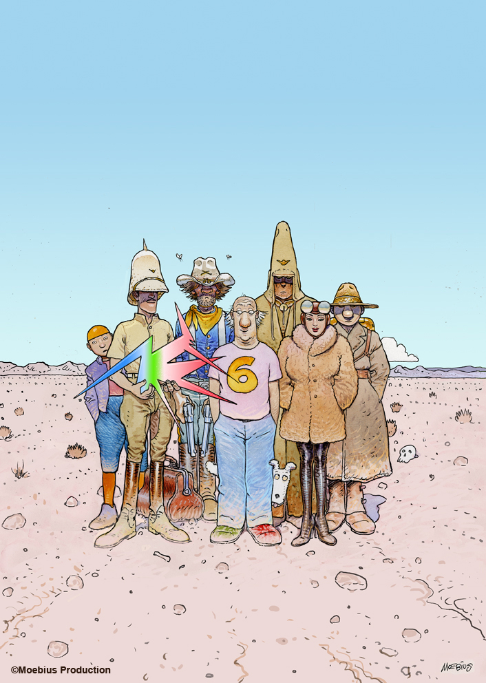
R.I.P. ~ Jean Moebius Giraud

Thanks danman, I hadn't heard the news before i saw your comment and link to the news.

Like many others, have have many fond memories of Mobius, how his work affected my life.

But for now, out of respect, i'll just let these few images speak for themselves.

- sam


Tuesday, September 6, 2011

Wood & Feathers, and the Honest Line.


Crap load of Heros Landlady comics are coming for Neil, Mike and me to sign. This whole experience of working with these two... has softened me into accepting my old work (vs. the newer stuff).


I may draw a distinction on my mind between old and new, and I know the gloss of time makes everything old seem 'better'. Sometimes it IS - but the feedback I get from most my fans, is all of my work, good bad, old new.. is all part of a greater whole. Some will be into my weird creatures, or my julie/zerogirl/alt. looking types of 'sam kieth girls', .. or others are into the 'classic' marvel presents covers period. Or others swear my peak was Maxx  or others dig the storytelling stuff like Zero Girl, Four Women, Ojo, Bimbo, etc...


Some of these fans shrug or scratch their head at my fashion stuff,


..or or abstracts, collage pieces, bolts, wood, feathers, all cobbled together...


satisfies me.


My job is to ignore just to keep working, trying new stuff.


See where it leads me, even if it is a dead end, or pointless.


Try to 'draw my way' out of my problems. Find what I call the 'Honest Line'. It's not always pretty, or slick, but it's a line surpassing style or form. To me, no matter how crude, delicate, rushed or careful, it somehow spills out from a pencil or paintbrush onto the page and seeps into a readers heart and imagination.

This is why Jamie or Gilbert Hernandez, Moebius or Alex Toth's art can seem simple, yet (for me) has such a effortless, yet profound effect.


No wasted rendering.  They *can* render.  They just just choose not too. It's just all -- there. Nothing wasted, just simple, honest, unfettered. Sorta like a chinese brush painting.


Meanwhile, there's the rest of us... fumbling along.

But that 'honest line' seems like a good place to fumble towards..