Friday, July 27, 2012

Rough Hand Sketches and.... Oval Eyes?


Rushed today as an old artists friends are dropping by today, Alex Pardee of course i've known for years, and and a new guy, an artists Skinner who's work i've enjoyed for years, but never met in person yet.


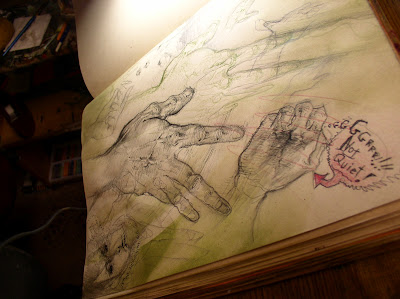
Here's a few hands i doodled for the Second World's Art book, since I'm already compiling material for that one.


Here's a curious old wooden cup with a vintage Trout Ad on the side ~ this is just luck, but notice how at the bottom.. how the patterns on the wood swirl into the folds of the paper in the Trout ad?  Too weird.  I mean.. what are the odds of that happening? I didn't plan it, i just notice it afterwords.


I don't know why i got so got into crazy rendering this hand with a pen...  must have been in a  Way$hak mood.

Here's that curious effect where even with the same light on my drawing table, depending on how the camera catches the image, it either looks yellowy warm or colder blue. Not thebulb either.


Always a good idea to look at your own hand every once in a while and draw it. Course my vines aren't nearly this pronounced or visible. Or.... my last two fingers quite so distorted as these.


...and sometimes.. Grrrr ~ i just can't draw a hand at all.

So lemme try something else.


This will probably wind up being a nola drawing..


her face is really rough.. eyes totally simple so far.


wondering if i can pull of trying for keeping her simple oval eyes, but do a little shadow around the edges? Implying there's some skin folds those eyes are embedded in? 


but for now let's juts finish her hair. 


why not go for a dramatic swirl at the bottom? 


okay, now i wanna *avoid* darkening her hair, for a change. Least at the bottom... keep her lower hair and figure light and diffused.. 


only get detailed up by her face... 


or as detailed as i get on this one.. which is to say pretty damned simple. Pastels to wake me up a little. Breaks me of the color pencil-ink cycle i usually lapse into so often. 


some warmer skin tone shades, crimson, vermilion, 


maybe a little vandyke brown. some pale orange.. but not to much. 


mostly intuitive choices.. possibly mistaken ones. 


just seeing how they mix together. But outside of her eyebrows, nose and llips... i don't wanna get her too over-rendered.   


So, it's getting there. I think the colored pencil hair and red-ish top is a nice contrast to the thicker more oily pastels on her skin.  a little shadows around her oval eyes too.. 


kinda disturbing when you try to render Nola isn't it? 


Kinda funny how often we see these round hallow eyes... Little Orphan Annie, Peanuts, Calvin and Hobbs.. i don't know why i'm so drawn to them. 

Sometimes people ask me why i gave Dana and Nola dot or oval eyes... sometimes i revert back to 'normal' ones in a panel or two... but it is something that just makes characters seem ... more lost? vulnerable? 


I remember one of the producers of the aborted Four Women movie ( back when there was one, which i was directing... a lifetime ago).. movie telling me how he never realized how much my round eyes made the cindy character's revenge against the rapists seem so much sympathetic, even than the other woman who had 'normal' eyes. 

What do you think? 


... is there something compelling about oval eyes?


Sunday, July 22, 2012

Three Faces of Catherine


Here's something i just sorta pulled out of my ass ( ...so to speak.)


Since Moebius was on my mind lately.... I drifted back to doing a face in an 'Idyl' Style, which were these beautiful a one page strips Jeffrey Catherine Jones did for National Lampoon in the 70s.  Obviously nobody draws women like Jones...


but, as a tribute, i thought i'd try inking three women's faces in three different styles.


Also, the title also being a pun on 'The Three Faces of Eve' movie, (as my ALL my art seems to suffer from 'multiple personality disorder', style wise..)


okay, sorta boring right now. also hard to see in light pencil, but you get the idea.  i'm not worried yet about the faces all looking exactly the same, a few eyes on some faces are little too hight, so will try to correct in the inks. But the point isn't them looking exactly the same, is it?


it's more an inking exorcize.  I'm trying to use a dry brush here.. that's why i've let it try enough to make 'tire tracks' on this piece of cloth..


bu first a little brush for those eyelashes.. the dry brush is mostly for *very light* ... almost feathery shadows right now.


in fact let's not even use a brush n her hair.. it's going to be the lightest of the three, so why not black colored pencil on the hair.


THERE - at least i'll have the self restraint NOT to add a wash for a change, which should keep it nice and airy. Sorta dark on left side, lighter on the other.


So next i'll use a thicker dry brush like Jones used in his Idyl one pagers. These are harsher direct lighting. This style is always trickier because any pencil flaws stick right out.


We have no soft face rendering to hide the flaws in do we, with classic black and white it's all 'out there' like a sore thumb isn't it?


I can already see her left eye is too high, so i didn't correct enough. oh well. This one came out much faster, and i tried to keep it rough and high contrast mostly...

...but i cheated a little.....add some thinker rendering brush lines in a few spots ..


Onto number three... for this let's do it in a nice blue grey with one of those asian pen brushes.. theres that lens shadow on the paper from my flash... sorry about that.  I need to pop for a new camera don't i?


 This face also went pretty fast..


you can see the ugly brush lines in he hair though. this time let's use a way to soften those, eh?


okay, that's a little softer.


i won't start in asking which everyone likes better, though i am curious.

Maybe a better question that which one we 'like best', is just... understanding what each one has to offer. Why choose one of these styles in a drawing or story? ( or a hundred others styles i'll never master)


Each style creates a different mood, even aside from the technical drawing skills in the faces themselves, ( or lack there of).


So which one i use might depend on the mood of the story, or even just mood i'm in when i'm drawing it. Duh. Belaboring the obvious here.  Guessing i'm working it out in my own mind though, because i so rarely articulate this crap, it usually happens automatically. Intuitively.


Funny, ... i was telling Jon Way$hak how, in my mind.. that when i'm penciling the Hollows panel i  pretending I'm doing my own version of Moebius drawing.  But when i ink a Hollows panel, i find myself imagining i'm Jeffrey Catherine Jones.

Course by the time i finish with whatever washes, colors or additional inks, it looks nothing like EITHER of them.. not that i could look like either of them in the first place.

So in an odd sorts of way, trying to draw past i usually look like, usually results in a more interesting 'sam drawing'.  Not always.  But, sometimes.


Even if what was originally in my imagination....

....never comes out of my pencil (or brush) as i intended.


Monday, July 16, 2012

Hollows Cover 1


...I guess Chris Ryall showed off the Hollows cover at San Diego comic con this friday, so i thought I'd throw up a couple of versions of it here on the blog too. I was torn about what do draw on this cover, because i wanted it to look more organic like the book does.


(Btw: Here's a version of the same cover with a subtler background texture i added in photoshop.  the cover on the left is a more hand done, and little washed out because of the camera flash)


By 'organic' i mean not slick and perfectly polished... more rough and less technically showing off. I' think i've done enough of that crap in my career, eh? But at the same time, it IS a cover, so it needs to have a little bit of a 'wow' factor, right?

Both covers are hand done... the big difference is the back-ground color.  It's really just personal preference on whatever background one likes. Digital gets a bad wrap, but i do like the choice it provides mostly background options.


But composition wise, my main focus ignore melodrama and o do just a simple Three Figure Cover, with...


1  dude with wings
2  little girl
3 'burp': ( the pink chibi-esk critter )

..all just standing there.  Shows some scape of the wings, and that the storys about more than just big-ass Giant Tress with Cities in them.


Sometimes simpler is better. Hopefully.


Here's where i didn't do it in a big enough sheet is bristol, but i's already painted it so i had to glue in another sheet of bristol to make the top bigger. i wonder if it will show up in the printed comic? Probably.


The gears inside the wings were an interesting challenge, i didn't want to just ink them and hand color them, (which is the way i did in  most of the book.) i wanted to 'suggest' them in a rough painted style.

So i tried to do the 'under shadows' of the gears which are somewhat visible, then add some gear high lights which in white ink, so they'll bring out some shape of gears..


Once i added water, 80 perfect of all the gear detail just TOTALLY evaporated..  and most of the detail will get lost when i added the wash over the gears. but i tried to working back in and bring out some shadows and highlights...


..or that was the idea. Might not have totally pulled it off. Either way, but was cool trying to try something NEW anyways.

Here's those two version of the cover again, but i added a third 'scanned'  version (so you could see it without the camera flash)..


So the only question is, not which is most dramatic, but which works better for this relatively quiet three shot of them?

---------


Now, just for fun...


 here's a few quick pics of a curiously manic looking distorted fellow who i did in ink and pastels..


not trying to pretty or detailed here, just wanted to capture some motion and gesture.


okay,  can't end this post with such a unsettling image...


how about a nice big haired asian lady instead? Better?


Oh hell, let's just stick with the cover then as a 'end' image.

- sam