Just for fun..
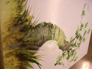
this green tree was done on the back of a comic book board with waxed surface.
almost threw it out... but seemed a waste.
i was able to scratch some leaves into the wax with an exacto knife.
also across the tree trunk too.
you can see i 'slimmed' the trunk down too..
decided not to hide the blend, since i wanted a soft edge to the trunk..
this one's a little different..
i cut out another tall skinny strip of bristol..
this pics a little burry, but i left it in because the focus is the center. I wanted to blur the branches so i used a pen with non-waterproof ink...
i think i got lost in some detail along the way though.
I was trying to avoid too much rendering..
but the temptation to blue the top and olivia the bottom was too great.
as we all know, with watercolor, you just close take a breath, tilt paper, and see what happy ( or unhappy) accidents happen...
anyone else notice how a different proportion causes you to think, and draw different specially? Not just drawing a vertical tree...
... but being hemmed in with a certain proportion?
almost like how a photographer crops and composes an image, isn't it?
well at least this Tall Tree... feels slightly different than the Green Tree, (which is the usual cliche Tree usually fall into painting.) This tree fells like a lush soggy Autumn to me, which i can feel and smell in the air right now.
Plus if any of you got sick of looking a side-ways Judge Dredd, now at least...you have something *else* to stare at when you check this page, eh?
: )
Until the next one...


