Btw, finally got around to answering some of a bunch of Comments in Last Few Posts.. (so skip down to hear me make bad jokes, shamelessly suck up to you for writing in, or just shoot the shit along with the everybody else.)
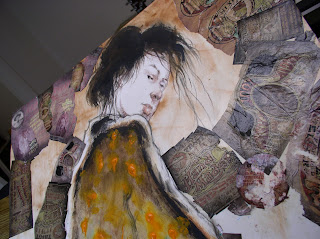
Okay, now (drum roll) to bring this Asian Woman painting to some sort of ... Dramatic Conclusion.
i'm starting with her face first...
.. this nose of hers always bugged me a little..
..sticks out a little too far.. so i'm moving it in slightly.
sorta hard to see at this angel, but here's a dirty low-rez photo of her nose before, then after, so you can see what i mean..
since we're not in a photoshop fairy tale~land, the only way is to paint over the nose, then rework it inside her cheek.. i
Above, if you look closely, you came see her old nose under the white acrylic paint, where it used to stickiout over her cheek..
So, a little anal... but whatever...
Meanwhile i'll try to touch up some details i want to show up in the ads themselves.
I'm tempted to just fully work some flesh color skin tones down and re-paint her face fresh, but .. once upon a time..
i a ga-zillion years ago... was TRYING to do a Non-Labrious Simple little Brush Study of her face...
..which as we all see... somehow turned into adding the Antique Trout Ads...
..then turned into Defacing said Trout ads... so their all mangled, torn and grungy looking.. (which i did like, though i missed the empty version too)...
..which that THEN turned into moving her nose..
and adding some brown pen work to her face, (which was my way of trying to still keep her face from being totally over-worked)..
and which has NOW it's turned into my feeling like the the Trout Ads are too jarring by themselves.
so now i'm recklessly adding some white Acrylic, to soften the edges where the Ads meet the white Illustration board ...
I have a feeling it could either look Really Cool..
... or look totally Sucky..
.. either way, too late to flinch now.
Now i'm sorta starting to *like* these rough textured edges the tissue gives the acrylic white makes over the Trout Ads, so i leave them rough in some places...
other places, i work Acrylic in more smoothly.. even finger painting it in too. (which is nothing new, lots of folks finger paint - just ask any kid!)
I try to work some darker Red Ochre into the Ads at the top ... so your eye doesn't get lost in all that detail.
Okay, darker on top, with sight spilling between the Trout Ads ... then the bottom getting very translucent.
so, were left with ~ what? (other than this piece of tissue paper i forgot to pick up?)
this.
and this...
.. the FINAL (quasi-bastardized) version of the original asian woman painting!
I think i'm fond of both versions... for different reasons. Glad i took a few shots of the before though, just to see how it morphed ( or mutated?) ... into whatever it finally became.
i still feel... like... *something* ... just got lost in this later Trout version.. i'll always have sympathy for the first brush version of her and all that white behind her.
but it's all moot now. Two hours later, the paint's dried - and it's all over. Each painting we do is sorta just a little snap shot of who we were when we painted it, eh?
And clearly i was waaay into excessively decorating the crap out of this sucker.
But , hey... least i had fun trying something new.


