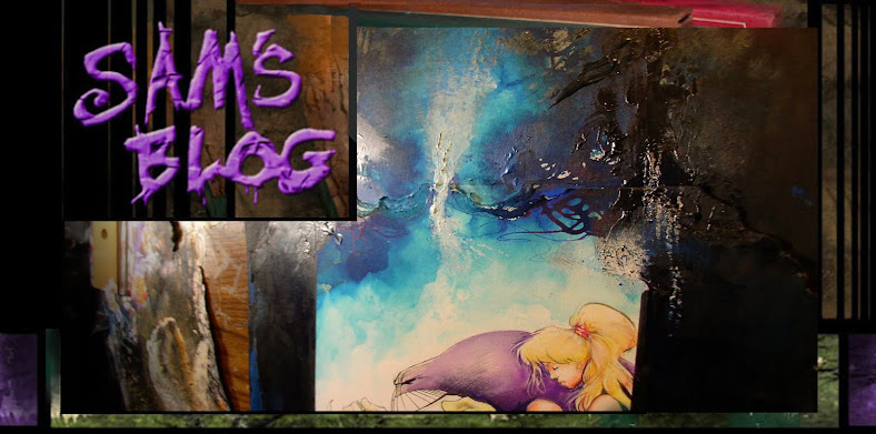
on the left is a 'fashion page' from the Worlds of Sam collection, and i literally painted over it for a new Maxx cover. I had to turn the page sideways for cover proportions.. if you look back and forth, you can see what shows through from the original painting.
Here's the finished cover with the logo. Julie's a little abstract, but i liked that.
This was the third redo this Maxx cover, and the two below were my first stabs at it.
The first one was okay, but kinda seemed too conventional.. the the second one felt too abstract, at least for a Maxx cover. A lot is down to whatever your taste are, but in this case, since i own the Maxx, i have just enough freedom to make a dope of myself.
Here's a semi-abstract painting of yet-another-1900s woman. It started with a botched effort yo paste down a Twout at I drew... when i pealed it up, l was so impressed with the texture it made...
.. I tried to "blend" it with gold paint into a woman's hair...
I added some distress grunge to her face, to echo the torn texture up top.
it''s not finished yet, but its getting there.
It's hard to take credit for gold acrylic paint, which anyone could add. I took these pics because gold acrylic highlights never scan very well.
It's always better to cast some light on it from the side.
No clue where this will wind up. Maybe one of the Twout books.. or somewhere else. Just another side project between Maxx stuff - a like drawing Maxx, but a few covers can drive you a bit batty.
And now we end with the other end of the spectrum. From an Abstract & Messy Maxx cover, to two simpler ones.
One's almost a zen brush painting,
and the other is just a peaceful simple sitting under a tree shot.
Sometimes simpler can be the coolest of all.
- Sam


