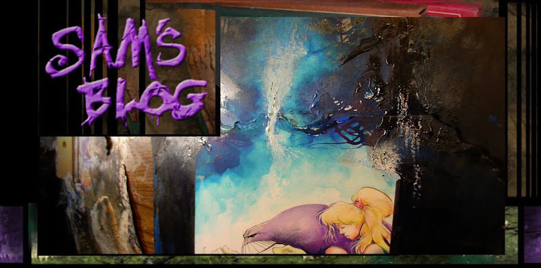
Drumming up two cover's at once for the reprints to try an get ahead..
This stared as a wet-in-wet color for the purple, then I added detail on Maxx's body with dyed brushwork in his body.
It's actually fails at what i intended, to almost do a sepia colored cover with very little saturation..
but if i wanted subtlety, i shouldn't have created a super hero who's the color of a grape, eh?
Least there's some subtler texture on the tree and moss, which are mostly watercolor, marker and watercolor pencils.
I've put off finished it until i can pull in Julie, who looks a little too distorted, even for my taste. We'll see if i can save her on this one.
Markers seem to be breeding like rabbits lately. Those pen/brush ones are additive, though i still usually prefer brush & india ink.
Here's a total change in mood, a did a short Garbage Pale Kids story, which is close to drawing an underground comics as i get anymore.
Before you think me crass for doing Garbage Pale Kids story, remember this is the same guy who draw Toxic Avenger covers and stooped to drawing a Hamster book during the Turtles funny animal craze.
So I basiclly have no shame. Proudly so. I threw in the same Mom I used in my and Ryall's Mars Attacks story, and i bet this is the *only* GPK story to have Sigman Freud help the Mom who's struggling with her her sons disgusting preoccupation with "bodily fluid".
Remember Amy in Zero-girl got advice from Carl Jung reincarnated as a rolly polly bug. So I'm both pretentious and grotesque, all at the same time.
The cover was a parody of the old Jaws poster.. so instead of the shark, which would have been too similar, i used this over-sized boy instead.
Coloring it probably took longer than drawing it, but it was still kinda fun to draw something different.
Last one, Mom about to take a bath.. and the shark shows up to surprise her. Totally ridiculous, but i need to draw something totally stupid sometimes.
Here's some roughs for the second Maxx cover.. these are the thumbs, about two inches high... i dunno who i bothered to color the rough, just doodling and got distracted..
Julie looks a little think here so far. One thing I'm trying not to do is to re-capture what's in the thumb. The orange pads are just my lazy masking efforts.
I can't decide if the Maxx should have the "serious" eyes ... or the big wide-eyed "worries" look in the larger final version. There's no right or wrong, but we'll see what mood I'm in when i finished it up... probably over the weekend.
The little taped spots on Maxx's back are where the logo will overlap his back. Again, I hate to lose to much brushwork in his arm, but the more color layers i add, then i'll just have to go in all over again and re-ink, with a brush... it's stupid how much brush work is lost on my art as a resulting of coloring.
Yes, i could add it digitally, but just lazy and easier do to it all at once.
Here's some pics of one of the older Maxx covers.. it has almost everything in the top, leaves, sand, glue, hair, macaroni, whatever i could get my hands on..
Again, a lot of this crazy surface texture never prints when scanned and, before artists postings blogs, few people would even see how the originals look.
I think if i ever did a book of Maxx art book, it would be stupid not to add some photos showing these textures from side angles along with the flat scanned version, don't you?
I guess in some ways, an artists is just putting in things for themselves. Things they figure wouldn't ever see print in the final. Some of those Sienkewicz, Bisley and McKean covers have wicked detail if your lucky enough to see the originals.
There's so many amazing artists out there who inspire the rest of us. I kinda feel, (at the risk of sounding self effacing), that have always hoped i was sort of a middle ground artists, someone who beginning artists could see as a bridge to these better known artists who have more skill and draftsmanship than i'll ever have.
Sorta like, " Hey, maybe i'll never be as good as my <insert favorite big name artists here>.. but if Sam can do *that*.. make those mistakes, and own them, point them out with humor and fun, then somehow maybe i can find a niche for myself as an artists someday too. "
These artists blogs go a long way towards erasing any bridge between "professional" vs "amateur" artists, which as we all know are kinda an absurd distinctions to begin with.
Just tons of people doodling goofy crap and throwing it up online.


