( Update added to bottom of this post! )
-----------


Also, kinda interesting fact, as you can see above, the original Maxx 9 panted cover is NOT red colored.
 The original art's (right) was actually PEACH colored..!!! ~ years ago, i had the production guys at Image reddened the cover up in photoshop because i though the original didn't look 'violent' enough. Now, i actually prefer the original peachier colors. Which do you like?
Above is a cool contrasts.. my New Maxx 9 cover. on the left, and the classic Maxx 9 cover on the right. In some ways, how i paint Maxx is totally different than how I used too, and in other ways, some of same weirdness. . . . carried on with a changing bag of tools, tricks, ideas.
---
Here's the same cover, hours earlier. Paints still wait on top, as I've darkened a new upper layer.

This is like the third variation on this cover's background. So much gets lost in the printing too.

Started so bright and psychedelic. Now look at it..

Another shot, but this one catches more of the texture.
Some things i would have never done back then, like the orange under-shadows.. also Way$hak pointed out for some odd reason i'm making Maxx's claws curlier now.. never noticed that.

I threw it up here again, since my black Maxx logo covers the top background, so now you can *what* the black logo actually covers up. Notice once it's dries, much of the texture is lost in a scan. But that's what's cool about seeing art from different lighting angles.
-----------
FYI: The Sandman exhibition at Cartoon Art Museum ends on April 27th.
There's a sandman piece Mike penciled and I inked in the a Museum catalog, limited to 1,000 copies pre-order copies now, since they won’t be going back to press with this one once it sells out. (I didn't post it because i forgot to scan it - sorry.)
If your a sandman freak, GET this book.
Just remember my and Mike's Sandman pin up are only one one page of it. But it does help a worthy cause, (the Museum), so here's order info:
Hopefully your not too sick of the Maxx. . .
. . but here's a few versions of another painted cover.
Thanks to everybody - looks like IDW blew through those Maxx Limited books pretty quick.
Promise to make the Maxx sketches worth it - I'll throw them up online as I work my way through them . . . so everybody gets a chance to check 'em out too. (remember, *this* one is a Maxx cover, not a sketch!)
I'd be forever if i tried to draw every sketch with this much detail.
Wanted to try something a little different with this Maxx cover, hmm. . . . not sure about the orange under-lighting..
getting a little psychedelic. . even for me. Let's see if i can't save it..
. . or make it LOTS worse...
either one. Okay, still a little busy? Too much going on? Probably.
Above's an earlier version and one i painted a little later, side by side. Tried to ground all that orange in the 2nd version.
Which do you like better?
Notice i painted over my signature. it was too big anyway. : )
I still think i can make the top of the 2nd version darker on the edges.
--------
I'm also doing some sketches for a few friends in some Worlds books too.
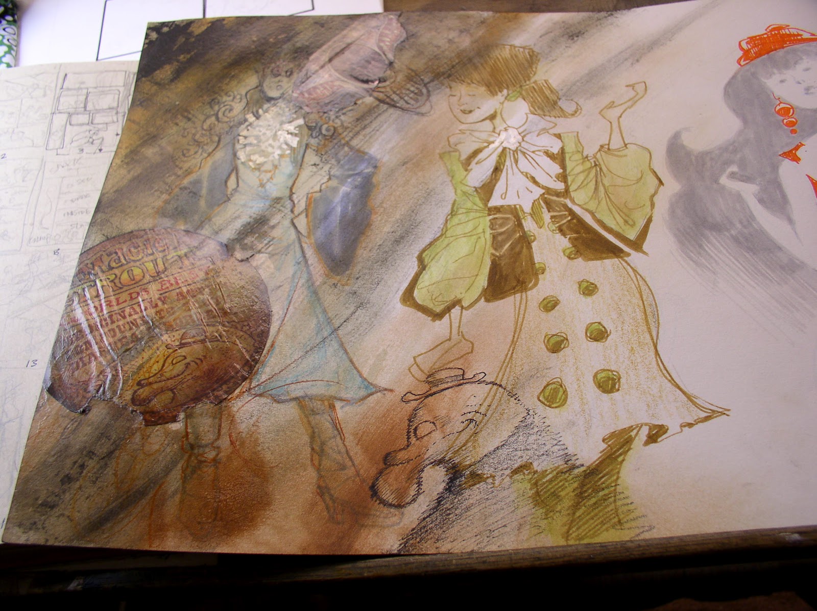
Notice the ink's still wet here. Can't close this cover yet. I love working on this brown paper. So restful this stained coffee brown isn't it? I love 'defacing' all my own art here.. scribbling over the inside pages like this.
Here's another one.
i'm not sure this is enough, seems kinda boring...
let's adding something else here. little blobs of white out floating up from this guy's eye ball...
Okay, this one's totally out of control now! * sigh *
In fact take a look at the same page ( below) in another Worlds book for comparison, see?
By now you've spotted the third book, and the little orange guy.
Just another weird same monster. Outback creature. whatever. Just more weirdness.
if the eye looks a little odd around the edges it's because i pasted it in. couldn't get the acrylic smooth enough.
That's what sketches are always hit and miss aren't they? It's like musicians playing live. No safety net. Esp. if you doing it in a big-ass art book, more pressure not to screw up.
But this (my worrying) is just me psyching-myself-out. . . because you couldn't ask for a more appreciative buncha fans than you guys n' gals out there.. 'course with friends there's should be even less pressure, right?
But it's fun too. A challenge. I'm leaving this guy alone. No need to busy it up top any, less is more here, eh?
Check out how the flash caught some of the paint texture in one pic, and hid it with a secondary source of light. Funny how light can either . . hide. . . or expose. . . brush texture, isn't it?
Okay, enough of this little guy...
-------
It's weird looking at all this old Maxx art. Most of my problem with Maxx had to do with publishing/editorial/printer things that had nothing to do with the story itself. Production crap, and various professional 'dirty laundry', ego, greed, gossip, tons of worthless crap that won't help anyone by being aired publicly and most of which have - thankfully - faded from everyone's memory.
For me, Maxx is like having Four Ex Wives, all getting together and revisiting you, and each compare notes. Tons of mixed feelings, affection, regrets, embarrassment, ambivalence. All that. But that's MY own personal baggage and neurosis, and damage, not yours.
Yeah. Maxx lasted. Weird. Kinda pretentious sounding, but I don't mean it in an ego way either. For some odd reason, it HAS left an imprint.
I know for a fact it's changed some people. . . because of the TONS of letters I've received over the years.
And even at SDCC, various strangers, who in an instant touched my arm, leaned into me, looked eyes with mine, and this weren't strangers at all... people who assured me yes, they *were* deeply moved by something in Maxx. Or that something happened in their life, *while* they were reading it.
Key moments, teen angst, someone they loved, lost, or discovered. Personal hardship. Trauma. Abuse. Broken heart. Healing. Recover. In the middle of a whole world or crap, they found . . . some glimmer of hope in the stories. words. ideas.
I know, because you've been kind enough to share it with me. This humbles me. Drawing him is second nature to me. All this, reminds me that, in a way, " I ", really have nothing to do with the Maxx.
It's something that travels far beyond me . .
even if it happened to have started because of me, you know?
Okay, enough of my babble. Thanks for listening.
. . and looking.
- Sam
----------------------------------------
UPDATE
UPDATE
Above is a cool contrasts.. my New Maxx 9 cover. on the left, and the classic Maxx 9 cover on the right. In some ways, how i paint Maxx is totally different than how I used too, and in other ways, some of same weirdness. . . . carried on with a changing bag of tools, tricks, ideas.
---
Here's the same cover, hours earlier. Paints still wait on top, as I've darkened a new upper layer.
This is like the third variation on this cover's background. So much gets lost in the printing too.
Started so bright and psychedelic. Now look at it..
Another shot, but this one catches more of the texture.
Some things i would have never done back then, like the orange under-shadows.. also Way$hak pointed out for some odd reason i'm making Maxx's claws curlier now.. never noticed that.
I threw it up here again, since my black Maxx logo covers the top background, so now you can *what* the black logo actually covers up. Notice once it's dries, much of the texture is lost in a scan. But that's what's cool about seeing art from different lighting angles.
Okay - enough already!
- Sam