Friday, September 9, 2011

Bunny, phase II

Tim's GF's bunny...

A little rough in spots, but a sorta nice raw texture... Some of the softness got lost, and the whiskers around the nose are a little clunky, but overall, it'll hopefully do. 


Wednesday, September 7, 2011

Bunny Jam, part 1

Here's a quickie,

My old pal Tim Kelly asked if I'd draw a bunny for his girlfriend's birthday. I told him, yeah, I'd do it, but  i'll penciled a pin up I wanted us both to finish it in our own styles.

Tim will finish it digitally, (because he prefers working that way), and I'll finish the same drawing 'by hand' over here. Then I'll send my finished version to Tim, who can present her with two versions.


Just something quick and fun.  Here's my quickie version. Stay tuned for the finished ..


Tuesday, September 6, 2011

Wood & Feathers, and the Honest Line.


Crap load of Heros Landlady comics are coming for Neil, Mike and me to sign. This whole experience of working with these two... has softened me into accepting my old work (vs. the newer stuff).


I may draw a distinction on my mind between old and new, and I know the gloss of time makes everything old seem 'better'. Sometimes it IS - but the feedback I get from most my fans, is all of my work, good bad, old new.. is all part of a greater whole. Some will be into my weird creatures, or my julie/zerogirl/alt. looking types of 'sam kieth girls', .. or others are into the 'classic' marvel presents covers period. Or others swear my peak was Maxx  or others dig the storytelling stuff like Zero Girl, Four Women, Ojo, Bimbo, etc...


Some of these fans shrug or scratch their head at my fashion stuff,


..or or abstracts, collage pieces, bolts, wood, feathers, all cobbled together...


satisfies me.


My job is to ignore just to keep working, trying new stuff.


See where it leads me, even if it is a dead end, or pointless.


Try to 'draw my way' out of my problems. Find what I call the 'Honest Line'. It's not always pretty, or slick, but it's a line surpassing style or form. To me, no matter how crude, delicate, rushed or careful, it somehow spills out from a pencil or paintbrush onto the page and seeps into a readers heart and imagination.

This is why Jamie or Gilbert Hernandez, Moebius or Alex Toth's art can seem simple, yet (for me) has such a effortless, yet profound effect.


No wasted rendering.  They *can* render.  They just just choose not too. It's just all -- there. Nothing wasted, just simple, honest, unfettered. Sorta like a chinese brush painting.


Meanwhile, there's the rest of us... fumbling along.

But that 'honest line' seems like a good place to fumble towards..


Thursday, September 1, 2011

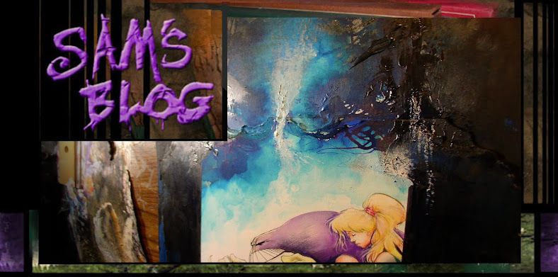
'Worlds of sam' painting.


Here's another one for the art book. It started as a possible collaboration with Wayshak, but when he saw it he thought there wasn't enough for him to do,


so I started messing around with it myself..


added to his chin a little..


poured in some color.. acrylic teals and yeah, even a little cheezy glitter i had lying around. Some powdered graphite, little big of this and that, whatever was lying around..

The little blue squiggles are Dr. Martins in a bottle, which I know does tends to fade. but i like using that to it's advantage, and have the blue fade off a little..


kinda enjoy how raw the canvas texture looks when you get in there with a camera.

couldn't decide wither to leave the graphite in here or whit it out with acrylic, so i'll leave it in for now. No, i didn't use Sensodyne toothpaste in it, (though it does look like it here) - it was just lying around the studio. : ) 


and here it is. More of less ... finished? more like.... abandoned? For now. 


Not much room to breath in here is there? Someday i'll learn what's left OUT can be just as powerful as doodling tons of 'textures for textures sake'. Just another painting to throw on the pile, which can come out in the Worlds art book next year. 

I know I'll always be known for me comic art, which I like too.  But i really hope super hero fans would give these paintings a try. 

I had a friend who was embarrassed to admit he was less excited by my current comic book jobs ( in this case, 30 days) than my paintings and sketchbook stuff. I've had other people mention this too in a rather sheepish way.  It's not that they hate my work for hire jobs. I do the best work i can on those jobs - given, 1 they're not my own creations and, 2 the narrowing limitations of drawing any comics these days. 

Maybe it also is magnified by the fact i go back and forth, rather than only do Bone or Love and Rockets. But even Jeff Smith and the Hernandez Bros have done work for hire gigs too.  I'd hardly be the first creator to get more excited by creator owned stuff than work for hire.  It's not I'm holding back on the super hero stuff, it's just OTHER stuff is more exciting at this stage of my life. 

So, I consider it a compliment anyone likes this later stuff. Course lots of people will always prefer batman, wolvie or whatever frailer name brand character they know or grew up with. I grew up on those character too.

So that's cool.

But, hopefully ... *this* is also cool.  


Wednesday, August 24, 2011

Heros "Once upon a time..", alternate colored version


Sounds like the Heros Charity story is out, even though Mike Neil and I still haven't seen a copy yet. Everyone else has, judging my a little feedback Mike dug up, which is cool.  Thanks to Chris Ryall passed along some kinda words after on it too.

Yeah, i'll get to posting some progress stuff on the Landlady story later.  But just for fun, here's a side by side of two versions.

The pages above are the printed version that i did some digital tweaks on the background colors too, (which sometimes can look better, sometimes worse).  I didn't change 1-3 much,  so i'll skip those. But  from page 4 - 9 on.. here it is.


Their both pretty close, but by page 3 you can see some of the differences in the background colors.  I swapped some panels on page 5 to match the script better.


The hand done are definitely lighter . in some placed a little rougher too... esp. the faces and the rougher paper texture, which I kinda like the amateur feeling of it. What do you think?

Hey, I wonder if anybody picked up on on the splash page with the tree being an affectionate nod to the first sandman's stacked lettering in issue one? It's pretty subtle, so ahh.... please don't sue is, eh DC folks, kay? Pretty please?


...and just for the hell of it - here's a puzzling something coming down the pike.