Showing posts with label fashion. Show all posts

Monday, October 8, 2012

Monday: THREE out of FOUR-DAILY posts.


Okay, other than this Death pic, to kick things off...


...here's a series of things..


..still being finished... not sure if i should keep this woman's stripped top just black and white, or color it in? what do you think?


The contrast of how the thick fabric folds hang.... might get lost if i color in black and white. I'm so proud of myself for leaving the bottom all raw looking.  Maybe we get enough color just rom what we see in her sleeves?


The point isn't how smoothly i blend the folds is it? I was going for a it's contrast between black and white stripes... and the shift from solid black... to grey at the bottom.

So the question here is... is it time to walk away from this drawing?  Leave enough alone?


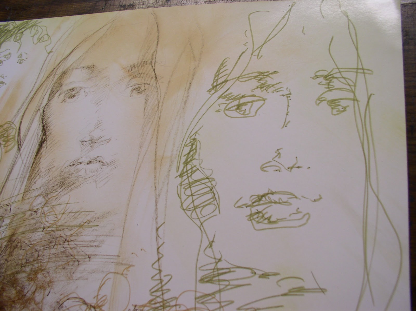
This one's not especially impressive yet. Both the face itself is sorta bland so far.


The texture clothed around the edges I used to wipe down my brushes, so i worked it around the edges of this drawing..

here's some options i may try to jazz it up a little.


I put it against a dark matt board, or could even use a black hand painted canvas?

A second issue is wither to start rendering her face... or leave it just have drawn as it is... and maybe blend the cloth on the sides into the face? The idea i had was to soften the abrupt shift from brown face to ragged blotchy cloth?

A third option is to color the cloth itself a solid color, so as to downplay the distracting various colors around her face.

I know there's no right or wrong, just personal whim of us artists. But with each decision, unlike digital (not slamming digital, i use it too)... but WHEN hand painting... each door you open, may close another one behind you. Which is both a drag, but also crazy exciting. No safety nets if you screw up.


So, unsure on this one yet. Maybe it's more interesting *not* to blend the edges? Leave it raw and unblended?


Okay, that one's up in the air. Onto something else... In this one were back to the shiny wax coated poster paper that's on the back of those Maxx posters i have lying around.

I almost threw them out, but they have inspire some nice fashion marker quickies.


I tried to keep this woman's face stark and let her hair and robe grab our attention. I threw in some botched made up Kanji here at this end... and by the other side... i sorta descended to totally random shapes that sometimes suggest inuit Bill Reid inspired Raven carvings, which i am totally in awe off.


Hopefully not in a pretentious way, just for fun.


'Mixing up crap that usually doesn't go together' is sorta my thing. Hobby. Guilty pleasure.  This one was about motion ( her hair) ... and two different visual alphabets, from Kanji to Native American Inuit art.

All doodled on the back of a Maxx comic book poster, which is sorta a third language. Kinda goofy fun.


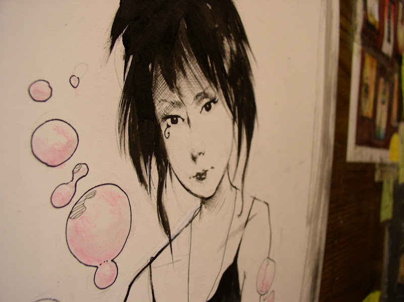
...which brings us back to this gothic lovely lady.


I never felt drew her as well as Dringberg or Chris Bechalo. She sort of came to life after i left the book.  For this commission i tried to keep it simple... the focus really is her face, hair and shirt.


The guy asked her to surrounded by bubbles so  had her blowing pink bubbles.


didn't have much chance for process pics on Death so i just grabbed a few shots before i mailed it off. Funny how simple these things begin isn't it? Any detail is like house paint and wallpaper,

but all our creations ....start with this humble little drawings on our sketchbooks.


Thursday, June 14, 2012

A little Something for Everyone?


This doesn't look like something i'd usually do does it? or maybe it does...


These quick sketches in markers were just yet another attempt to try to hammer my way into something NEW... some style that looks nothing like my usual stuff...


I mean, what ever my style even IS... it's all over the place... even on a good day, isn't it?


These may technically fall under the category of 'fashion', but that's a stretch. Here's a little rough brush work..


These are all rather rough... I was going for something between a design and a rough 'gesture drawing'... trying to avoid being too perfect.


I have to be careful photographing the backs of the maxx posters i keep working on as they are very reflective to a flash.


but i love the slick surface, it is great for using a xacto-knife or razor to 'etch' tiny white lines over india ink.. i didn't get into that here though yet..


theres are just an experiment - i noticed the dark blue version of her face was drifting off to the left, so i re-drew another one in golden brown brush pen under it.


the two faces overlapped may give the reader a headache to look at now... ( hopefully not.)  ..but refuse to judge this one yet.


Okay - here's another one... this drawing has the face at the top of this post..


i started with a few random free-floating faces and worked my way down..


.. and across.. here we are.. two studies of more or less the same face. One obviously pretty rough ad the other maybe a little *too* tight.

on both of them, i tried to stay light and not overwork them too much.


Here's the third face, again trying to reach outside of my comfort zone, and to do it i will stray into ugly, bad or poorly drawn face territory,


but it's worth it to try to sneak out from under my usual crap.


only you guys can tell me if it's working or not. opinions will vary, but i still welcome them all. don't be afraid to be specific about what you think works... or doesn't work.


or why.


here's that eye again in the lower left.. again i keep fumbling outside into the dark trying to shake myself up. I doubt any of these will make it into the art books, it's cool to have a little of both, web vs. art books. I mean, some stuff has to be pushed out of the art books.


I think the plan is... for NOW... we stick to these three 'World of Sam" books, (the first one seems to have it's own shape now, a smattering of everything in it.. mostly newer stuff and painted stuff. )

Next we can do some Collected Maxx stuff for those fans who just are into that stuff, (after 35 issues, there's too much stuff and it demands it's own series of specialty books. )


We can still get out the old classic MCP stuff for those who love the brush and ink lines sam, which is mostly the work for hire stuff in the Art of Sam book. So we'll let everyone get THAT out of their system.


Thus, way no one is stuck with a 'period' or style my work they might detest.  Maxx-heads can stick to Maxx. Classic fans morn for the old days and can get their fix there. And for everyone else, for an overview of painted stuff, boxes, mixed media stuff like i do on the blog, we do Worlds.


then later, after the dust settles, if there's still interest... once we are all old and gray.. THEN maybe we do a longer Chronological collected series of sketch books .. so you can track my.. changes, growth, year by year.... from old pre-sketchbooks, to maxx days sketches, zero girl, scratch, ojo, bimbo, up to these oversized newer sketchbooks i do.

Like this piece here... that starts with slick black shapes up top and degenerates to swell graffiti like scribbles at he bottom!


....and if everyone gets sick of all this crap BEFORE we reach that, then i promise we'll take the hint and stop publishing these suckers. For reals. kay?  ; )


Thanks for all the post comments, i need to catch up on those. I had a LOT to say about the MOTHer post so will follow up with some comments on post that tomorrow too.

Friday, December 30, 2011

Floundering attempts...


Okay, i fibbed.  Apparently my rut wasn't quite over... or maybe i just hoped it was. over.

This was a devil of a week for me for some reason. I tried dozens of paintings since my last post and destroyed or ripped up nearly all of them in frustration.

Like is said before i was determined to.. well, if not draw something new,

Then, . . . *this* finally came out totally by surprise.. a few hours ago..


it's a relief in a way.. i was hoping for at least ONE painting...

..that was relatively 'Minimal' by comparison to my usual crap. spare. understated.

..or at least bloody SIMPLE.. not quite so .. overworked?


I think this is what the other fashion ones i did last post were trying for, but failed at.


So, i breathed a sigh of relief...


THEN, weird enough... after i left my guard down..


another one popped on the next page, almost by accident.


i was just doodling a nod to an Rene Gruau illustration i always liked. Here it is, and i inspired by how rough and impressionistic the woman's white gloves were rendered.


i wanted to do my own funky version of something that rough..


sorta like i savagely attacked the paper with a hatchet..


(...or in my case, an x-acto knife..)  : )


Now these may not strike you guys as any better, or worse than the other 5 fashion ones i did before, and they may not be. But inside, something feels different here... less repetitive ... course, i know it does look like me, i give up on trying to look different than i how i look, but still.. just trying to reach for something... something ELSE... you know?

Real Life looms as usual: still have a ton of other comic book work to catch up on, but you know how it's almost a relief when your purged from being... (at the risk of seeming pretentious) ... so... creatively *blocked*????

It's not like i'm thinking what i did is so great here, it's more like passing really painful 'creative gall stone'.

just a blessed relief.  anyway, sorry for the 'blockage this week. : )


try to have a stress-free weekend everybody.
sam


Sunday, December 25, 2011

Drawing Out of a Rut... (or trying to!)

..

Today i just HAD to draw something... (sometimes my only way to relax on a day off is to draw or doodle)...


i tried some roughs of some faces... but it just feels like the same old stuff i always do.


so drifted towards some fashion roughs too.. still the same.

i wanted to look different then i usually do.  Cleaner.   Less 'illustrative' and more 'design-y'... whatever that means..  I love a famous fashion illustrator from the 50s named Rene Gruau. He has a clean classic look, and really has impressive illustration chops.

But on the other hand, i another part of my personality loves  modern 'grungy' alternative fashion illustrators like Julie Verhoeven. You may or may not dig her stuff, but i'm inspired by all sorts of non-pretty stuff, though my fashion stuff doesn't seem to show that much.

I'll never look like ether of these two, and i don't want too -just looking for some a creative jump start!


... but FIRST, i need some paper to draw on.  . . .found a batch of t old maxx posters in my closet during the move - almost throw out.


now i'm glad i didn't - they backs of these posters will make a nice shiny surface to doodle on,


partly i hope the slick texture will make me think different and maybe use different tools..


secondly because drawing on the back of something, even a poster... takes the pressure off.


i can just toss these afterwords if i don't like em...


but this is already starting to look to pretty and slick,


i wanted it  a LOT messier.. here's a big old brush i found somewhere.. might do the trick..


her hair's getting a little big, huh? yikes - almost 'bride of frankenstein-ish'.  well, i said i didn't want it to be too prefect, didn't i ?  * sigh *


here's a good example what coated surfaces can do, you can rub or scratch out paint textures with rags or  razors easily... i did this on some of the Raven illustrations for the Edger Allen Poe book, with mixed success.


But i need to shake myself up, get out of this damned rut.

Okay, CRAP - - still looks pretty much... just like ME still, eh?


Damn. okay, let's try again...

The other one took too long, i think going faster may pop something out... or maybe not,


but let's try this on in about 1 minutes, just to see what blurts out.


remember the point is *against* trying to be too finished, more like a impression or gesture drawing, only in color.


her jacket or sweater is starting to be the only interesting thing about her, huh?


the spiky hair sorta gives her the Punk-ish or gothy look -


again, didn't intend  it, just seeing where the brush leads us.. this is the old splatter bit every one knows.

Now... just think about this photo above... both hands busy, so how did i take this? (yeah, i have a self timer, but i forgot to USE it).  so,like an idiot the only way that occurred to me was lay the camera on my desk and push the camera button with my nose. pretty pathetic eh?

the only thing that's worse is.. i am telling everybody. yeah, that's worse.


so, where were we? okay, i give UP on sucker!  time to move on.


these still don't really seem as radical as i was hoping they'd be.. time for another poster.. (they made some of that julie's eye page too)...


i'm pretty surprised these colored pen-brushes don't bleed through the paper. i'm not even going to pencil this one, ( so lower your expectations) ..


i was late on the other and it took 30 seconds longer than one minute,


so let's try to see if i can whip this one out in 30 second flat - just to see if anything an adrenaline boots pumps SOMETHING different out this time!

okay, this one's done, 20 seconds is too fast. i did the face but forgot to take a pic of that, but i'll take one at the bottom do you can see her face.


ONE more... only let's take out time and do better.. say 45 seconds this time..


wow, forgot to pick up the camera this time - sorry.


it just sort of seemed to finish itself. (for better or worse..)

a while back i did a hulk and timed myself to go fast, people seemed impressed, but remember it's not a race. I obviously sacrifice detail when i fly through these... but i wanted to shake off some dust and wake myself up a little.


Grrr - OKAY-  so, maybe it's NOT possible for me to to avoid looking like my usual style, but hey.. it's worth trying. push myself out of whatever comfort zone i may be wallowing in.

now it's time to rest and relax.

have a good rest of your Christmas day.
- sam