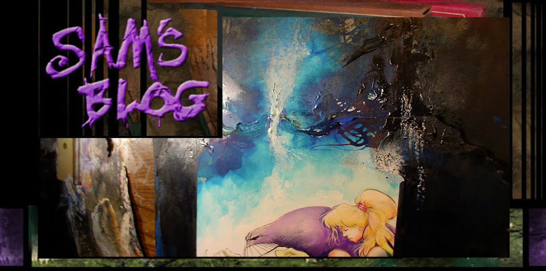
This is the top half of a 'plug-sandwich'. Plug on top, art in the middle, plug on the bottom.
Plug for my old friend Bob Chapman at Graphitti. He's painstakingly rounded up scans of vintage Sandman pages from all over the globe.
Don't ask me when he's found all this crap, but it's an impressive feat.
You can find it HERE … then search for it under: "Sandman Gallery Edition".
I've unboxed it today, and even as original art sized books go, this one is unusually LARGE.
In fact I'm not even gonna bother to remove it from the plastic. Why bother to break it open. Heck, i know what my art looks like anyways, right?
In addition to some Sandman art from me, there's also pages from Mike Dringenberg, P. Crag Russell, and some others Sandman artists too.
Now these here suckers comes in three formats:
* Cheapist is the Regular Edition.
* Next up is Signed Edition by me and Neil, which cost a little more.
* Last is a limited Remarqued Edition, which means it had an original sketch of Sandman in it by me, so because there's less of theme.. they'll costs most of all.
Here's an example of my sketches for the Remarqued Edition.
I've struggled with my feeling bad about my art on early sandman issues, but I've learned have compassion on my fledgling efforts on this project, and to since my Creative DNA is hopelessly mixed up of the Sand-a-verse...
over the years, with the support of friends like Mike and Neil, it's finally dawned upon me that in spite of sometimes flawed sophomore efforts on that book, that mainly because of the great work of so Neil and so many other artists did after me...
that it is definitely something to be *proud* of.
Now onto other crap.. Here's a page from an upcoming mysetry project
As you can see it still needs some panels to be finished. I wanted to fuse together an Art Nouveau 1890s design with my love of swamps and organic moss and swamps.
I liked how lose and unfinished the Hollows mini series i did looked, so i thought it would be cool to return to a more detailed ornate look, but mixed in with more stylized way. That's what i was shooting for, well see if i can pull it off.
Even if i fail, it'll be an interesting to at least try.
These two again. Can't get rid of them, can we?
I kept fiddling with this cover till the very last minute. I wanted something that looked more cartoony and loser. I think it took a while on the Maxx covers to relax, and nothing relax you more than failure.
By failure, I just mean ... if it doesn't come out how i imagined, i can be disappointing.
But if someone else digs it, than who cares what indulgent temper tantrums we artists puts ourselves through? Besides, sometimes i'm dead wrong. Sometimes i come back years later, and i say to myself: " Hey, this isn't so bad as i remembered, what we my damage over it anyways?"
Here's a Maxx cover i decided to leave in black and white. Mainly because adding color by hand might lose some of the detail.
Yeah, i could add it digitally, but i just thought it would be cool to have *one* B&W cover in the run. I did a lot of mixed media stuff in the original Maxx series, but i was too timid to add a mix of color AND black and white Maxx pages in the book. I came from the "if it's not colored, it's taboo" school of comics. The exception being books where were all black and white.
The Maxx illustration style was founded on breaking so many rules in mainstream comics, wasn't it?
If i ever so a Maxx series again, i think i could go from color to black & white, yet do to it in a way that wasn't distracting and made since to the story - what do you guys think?
It's funny how differently Julie looks in all these covers isn't it? All over the place, style wise.
I remember before i broke in, i wanted to avoid having any kind of style. I wanted to at least TRY to be as eclectic as possible. The problem is i ran up against limits to what i could do.
I still am humbled by this, plus i failed, in that my style sticks up like a sore thumb. But i think trying to stretch ourselves, however horribly we fail, can result in being a more interesting artist than i'd ever dreamed of becoming.
So were back to Sandman and "precieved" failures. I'm telling you guys, just ignore my words, their totally useless.
My art alone... says anything that's worth saying.
Here's the bottom plug. Sorry Jon, last but *not* least.
This plug is for my old buddy Jon Way$hak who has a new Kick Ass mini series he's drawing/inking, called Devoultion. It's overdue for Jon to get some of the attention he so richly deserves!
Jon usually lavishes his Mind-Numbing detail on advertising art, so it's a rare treat when he digs into comic books, so check 'em out!
Okay, sorry this post went on forever.. but at least your done now.
Finally eh?


