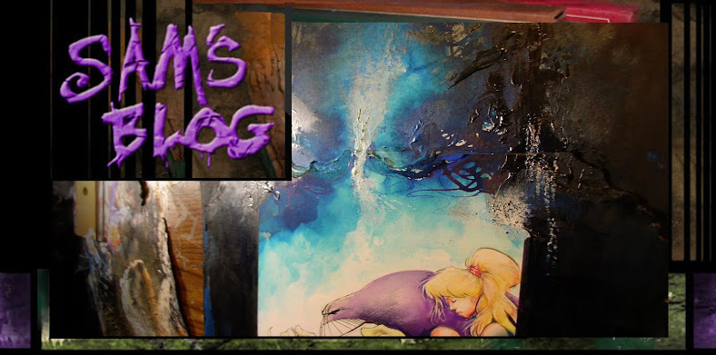
Here are a bunch of things lying around my studio. I've posted this asian woman before, but the textures on her kimono I just got just got around to finishing this week.
It's funny how a series of images, however randomly strung together.. it's odd how our minds make a story out of them.
This gold & pink texture are just brush twirls, and smears of acrylic paint, but the interesting patterns have inspired me to try similar textures in finished covers.
In fact you can't get a more different texture than the gritty, almost metallic looking aggressive smears in the bristol on my drawing board..
... and the wet-in-wet watercolor bleeds in this woman's kimono.
It's weird to think they came out of the same artists' hand in a way.
Something else i see dozens of times a day: dirty ink bottles:
I notice Higgins ink isn't dark enough lately, and it also it tends to bleed through Strathmore bristol board.
So i'm trying Bombay India ink for a change. The finished blacks are a little flat, but at least i don't have to add multiple layers of ink just to get solid blacks. We'll see how it goes.
Another random object lying around, an alternate pillar i wound up not using for one of the Maxx covers.
Here's the pillar i went with instead. I still think i could have added more highlights to this version, blended it better... it looks kinda blah now that i look at it.
Course most people may not even notice the pillar and just look at the Maxx.. so i may be overthinking it.
I keep coming back to this asian woman, i was tempted to make it a Julie cover, but i don't know if i see Julie as wearing a Kimono, or not being blonde. On the other hand, she died her hair red and went through all sorts of different looks in the Maxx, didn't she?
Naw, this doesn't feel like her.
I've always been a huge fan of matte paintings. From Citizen Kane to the early Lucasfilm Mattes, Star wars & Raiders Paintings, long before Digital backgrounds kicked in.
Course i don't posses photo realistic illustration skills, and besides, i have grown to like the hand-drawn..stylized ...and sometimes cartoony feel to my art work has...
But these little roughs, are for a series of full scale paintings for a series of 'cities in the Twout-a-verse' paintings. They will also show up in some short films i've done over the years. You'll notice i worked a few of my fashion & asian paintings into the cities too. Recycled crap, New crap, everything has a home. Nothing wasted in the twout-a-verse.
Though these sketches are tiny and crude, it's funny how small thumb nails like these can inform, give birth to and finally grow into full scale fully detailed pictures, isn't it?
Most of my covers came from crude little thumbs like these.
From different angles this kimono pattern almost looks like electric impulses in the brain doesn't it?
One of a dozen unfinished Maxx covers. You can see one of the Marble Watercolor brown boards overlapping it too, which will get gobbled up into another piece of art down the road.
Okay, almost done. Thanks for being patient. The delicate kimono woman and the crude gold-orange-pink metal images side by side. One of my favorite things about this woman's image is how i left the bottom empty.
It's taken me years to develop the courage to leave things open.
When i was taking these pics, i happened across this little 'end' logo, i did on the back of a piece of brisol, because i'd forgotten to add it to the end of a story.. so i drew, colored and scanned it in later.
Now it jumps out at me, all by itself... a small little 'end' image. Hiding alone at the end of a stack of art paper in the corner of my crap infested studio.
Seems like a good 'next-to-last' image doesn't it?
Okay, your probably sick to death of this one by now, but i had to throw in at least one shot of it - head on - to make up for all the distorted photos of it.
Thanks
Sam


