
After an absence this long, not mentioning it is pretty silly, even for someone as sporadic at posting as I am. However whatever personal issues I was or continue to go through, my dirty laundry - is not why you check this blog, is it?
I don't mean you don't care - I just mean.. Your mainly here to look at cool crap. Or hopefully 'interesting crap'. Or even 'crap that totally fails', but hey... a 'look' is free, right? Esp. online. So remember, when i 'disappear'.
There's is always a valid reason. No snub or disrespect intended.
'nuff said.

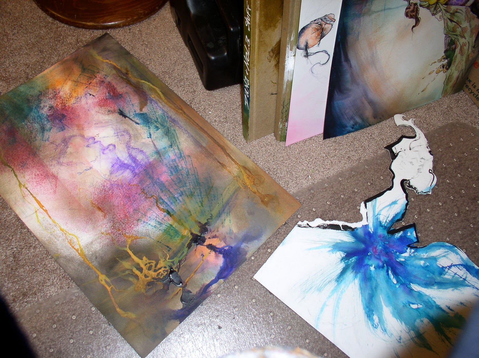
Above is a brief evolution of Maxx Cover 13. I kept avoiding adding to much color to the maxx..
.. preferring the 'brown paper' version of Jungle Queen Julie with her hair up..
But it's unavoidable. For better or worse... purple guy always sticks out like a sore thumb.

I came across this in a pile of art, it's a film for the printer, back in the negative days.. you'll recognize what page it's from.

Notice the primary colors on the left, the gray bar on the right. Kinda creepy image with the light coming through isn't it?

Was thinking when i die someday and - out of context, if somebody came across this in a thrift or garage sale.. somebody who didn't read comics of know the Maxx,
...they'd have no friggin' idea what the hell it was... would they?

Here's a Heros cover I did for their charity. Nightcrawlers hair is the star of the page. Weird to think for most kids who know him from the X-man movies, he's not gangly or skinny at all. A deign or 'character language' that only exists in comics.

Here's another Heros cover, just parody of my cover above. Just for fun. No idea what Adventure Time was, had to google it. Took ten minutes to draw, and it shows. But It still cracks me up.
If anyone bids more than 5 bucks for this sucker, their getting ripped off. : )
-------

Highlights off of wet ink on a page. Nothing like it.

Here's the third piece i did of these "Two Sisters" artwork, which i've posted before. Here's the anima version.. only i had to 'ruin' one of them.

The point of the original one was looking past an idealized view of women. Of in this case, an asian woman in a kimono.

Huge fan of Junko Mizuno, so part of it is just loves the cuteness of Anima/Manga, yet another part of me that gets sick of how cute it all is. Notice i made a smudge on the sister on the right, so i HAD to add a smudge to the sister on the left too...

So here's the next in the series. I didn't feel I'd 'messed up' the sister on the left enough. Yeah, her eyes were wonky, but i had to go further...

...now ... *that's* more like it! Gold-Green-Orange is a jarring combo.

Now before you freak out, just calm down. It wasn't that great looking of a face, was it? The point is the facade of beauty, or at least that's what i intended..
Gold paint's always a bitch because it usually scans so it looks flat. It's seeing the highlights in person that adds to the glowing effect.

Now before you have my guts for garters, remember i did a similar defacing of the original Sisters artwork too. But you know what... much as a lot of people scratched their heads, or wondered " aww, why'd he have to screw up those faces?"... ( which is a valid question ) ...
My heart was touched by one fan who stood in line at the Comic Art Museum. He pointed out this specific piece (below), and he thoughtfully explained me how, in his opinion, he felt it was not just a moving piece of art, but that it really touched him personally.
Geez.... that really melted my heart to hear that.
He's not alone either.

For some people they feel that same way about the Maxx. I think anybody who was open minded enough to pick up the Maxx in the first place.. is obviously open to new unusual kinds of illustration and story telling.

Heck, if a comic fan hated my art that much, they'd have to be *masochistic* to keep reading that book otherwise.. right?

I mean, i'm not even ashamed or bothered by it anymore...
My art's messed up, and so am i.
Come on, admit it... compared to most comics ~ the Maxx it IS...... a friggin' weird-ass looking book!

..but then, i guess, basically... everything i do pretty much is.
Thanks for hanging in there for me.
Sam